
We all know the versatility of Microsoft Excel. The software is very much use in creating graphs or charts.
It can also create useful forecasting tools like trendlines and performance measurement tools like sparklines.
Today we are going to measure errors in excel. Errors are the product of uncertainty.
Businesses fear uncertainty the most because they can’t predict the future. And every business aspect lies in the future’s hands.
Hence, calculating errors is a great tool to counter uncertainty and risk, so that businesses can prepare themselves for the worst and pray for the best.
These errors can be created through bars in excel.
So, today I will show you how to add individual error bars in excel.
What is Error?
There are three error options in Excel.
- Standard Error: It shows the error of the mean for all values or in simple terms it shows how far a sample’s mean falls from the actual or population mean.
- Percentage: It shows the basic error of a default 5% both on the positive and negative sides.
- Standard Deviation: This shows a default of 1 standard deviation. The standard deviation shows how close a sample mean is close to its population mean.
As excel has default values for all these errors, keeping the default option is prone to inaccuracy. So, we have to use a custom value for the errors.
How to Add Individual Error Bars in Excel?
So, let’s see how to add individual error bars in excel by adding custom values.
Step#1 Create a Data Table
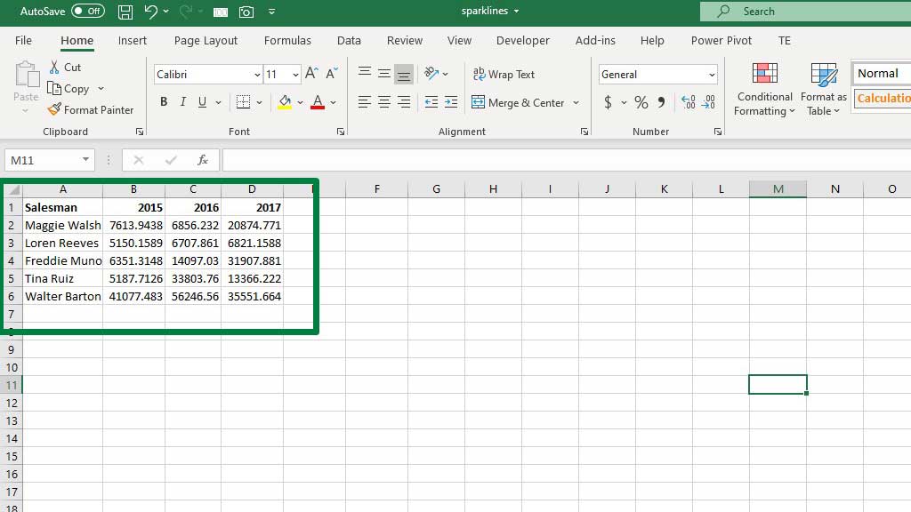
This is a sales record of 5 salesmen. We will show how their records vary.
Step#2 Calculate the Average and Standard deviation of the Values
To calculate the average you can use the average formula. Type the following formula
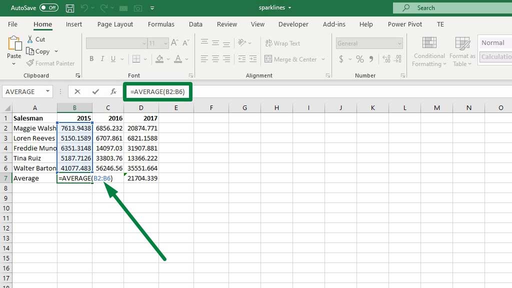
=AVERAGE(B2:B6)
After calculating the average, it’s time to calculate the standard deviation. Type the following formula
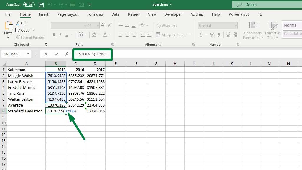
=STDEV.S(B2:B6)
Now that you have calculated the average and the standard deviation, it’s time to create the graph.
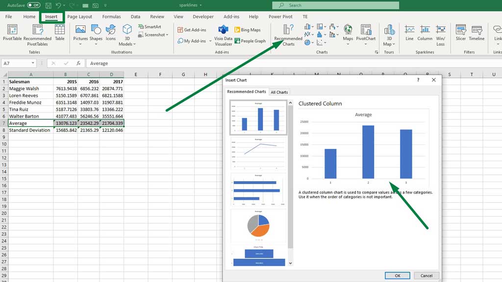
Step#3 Creating the Graph
First, select the average row and then from the Insert ribbon go to Recommended Charts and select a Bar Chart.
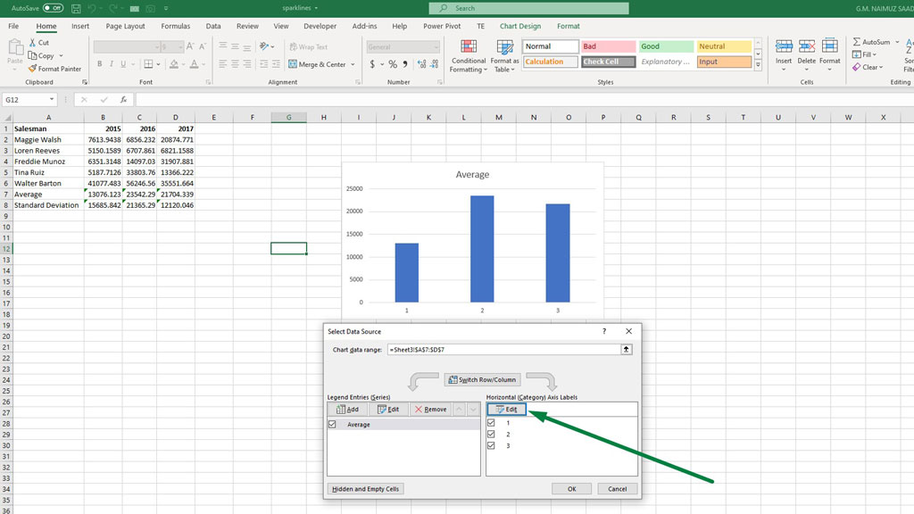
To fix the horizontal axis labels, select the horizontal axis and right click. From the menu select “Select Data.”
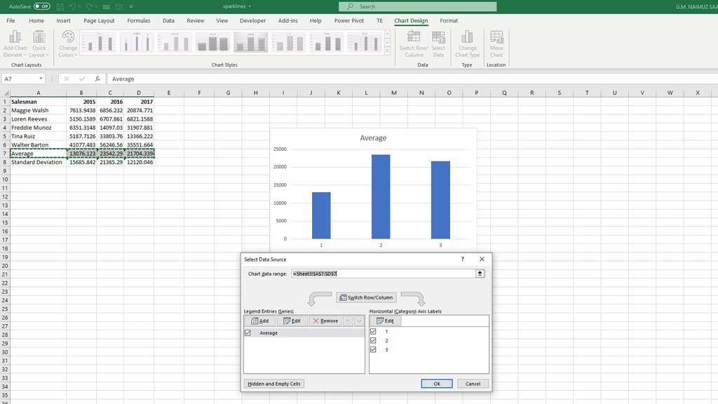
Now, edit the horizontal axis labels.
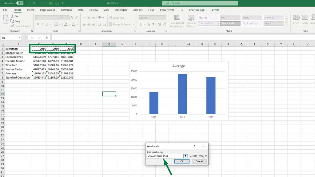
In the axis labels dialogue box, select the row that contains the years and click ok.
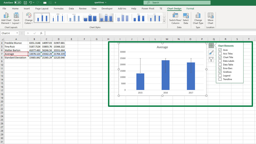
Step#3 Adding the Error Bars
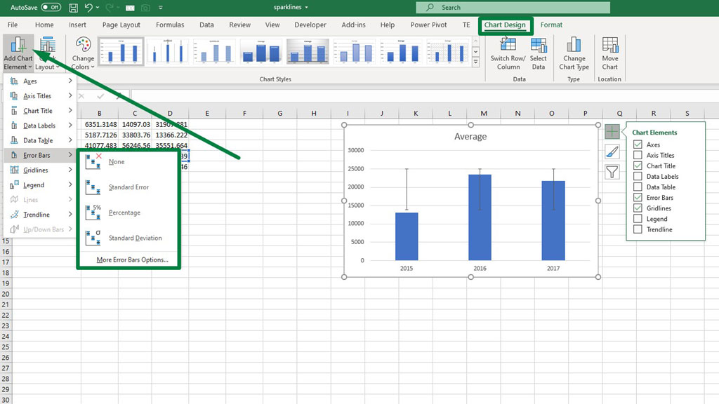
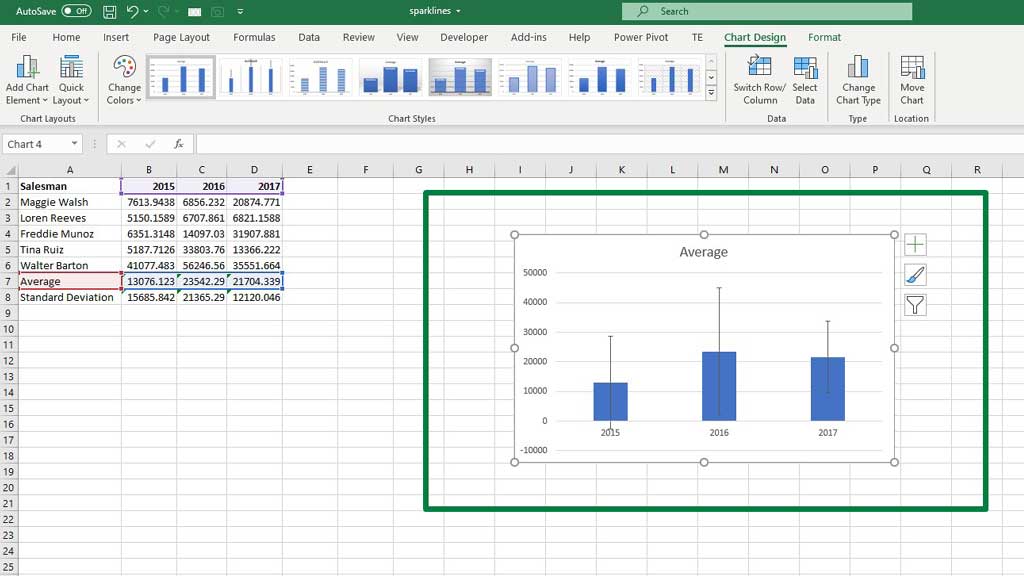
Now, select the graph and you can see a green plus sign in the upper right corner of the graph. Click that and then go to Error Bars.
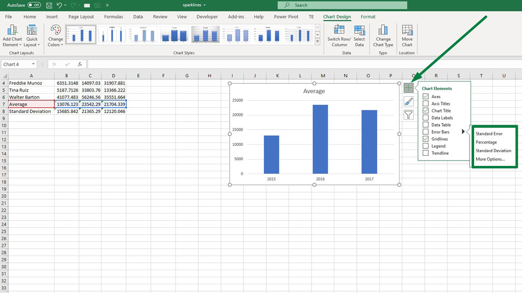
You can see that you can add three types of error bars. For now, choose standard deviation.
You can also error bars from the Chart Design ribbon. From that ribbon go to chart elements and add standard deviation error bars.
Now we have to customize the error bars. From either of the process, go to More Options. And then select Custom and Specify Value.
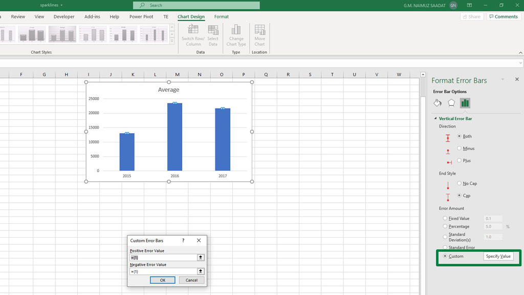
In the dialogue box, you can see that the value is already inputted as 1 which is the default standard deviation for the errors in excel.
Delete those error bars and select the row of standard deviation for both positive and negative values.
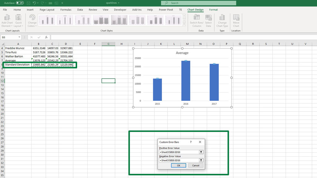
Now, you can see that your graph with customized error bars has been created.
Conclusion
You can use the default error bars in excel but that is not accurate. Because they are default and may not comply with the actual results.
So, it is better to calculate your standard errors yourself.
And now you know how to add individual error bars in Excel.

Hi there, I am Naimuz Saadat. I am an undergrad studying finance and banking. My academic and professional aspects have led me to revere Microsoft Excel. So, I am here to create a community that respects and loves Microsoft Excel. The community will be fun, helpful, and respectful and will nurture individuals into great excel enthusiasts.