
Visualizing data in Microsoft Excel is easy, efficient, and appealing to the eyes. It helps people grasp the potential impact of data analysis even more.
You can graph equations and functions, make Venn Diagrams, Stem and Leaf Plots, Supply and Demand Graphs, Burndown Charts, and many more in Excel.
But there is more to it than just creating graphs in excel. As shown in our previous blogs each graph is created for its own individual characteristics which help visualize different kinds of data.
However, there is always this visually appealing part that gets tagged along with graphs and charts. It is as important as creating the right graph for the right type of data as if the chart or graph is not visually appealing then the general audience will not find it interesting enough to pay attention to.
Hence, it is also important for analysts to create beautiful graphs that’s why there are several preset chart styles available for every graph or chart.
So, let’s see how to change a chart style in excel.
What is a chart style?
A chart style is the outlook of the chart. It is basically how the chart looks in terms of background color, the color of the bars, columns, markers, etc.
It is sometimes individual preference or might be specific requirements from your client or the company you work in to make your chart in a specific style.
So, let’s see how to change a chart style in excel.
How to Change a Chart Style in Excel?
First, let’s make a chart. Any chart would do, all chart styles can be changed using similar principles.
So, we have made a bar chart, now let’s see how to change the style of the chart.
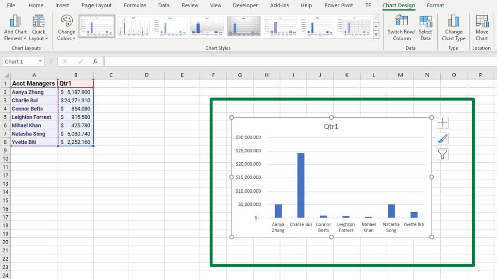
If you notice, Excel’s default style consists of blue color, with a white background and nothing else.
There are other preset styles in Excel. You can choose a wide variety of styles from the Chart Design ribbon.
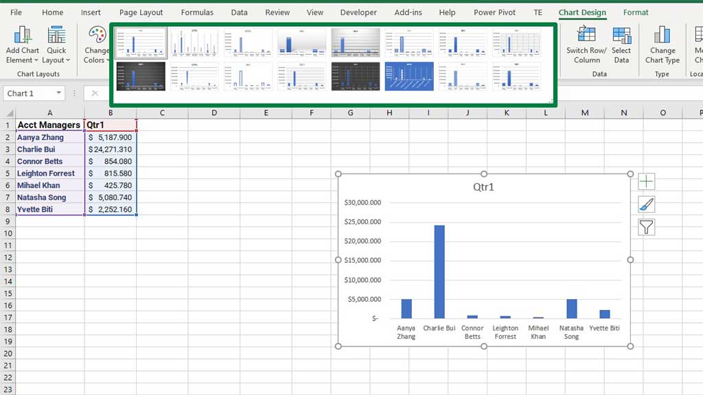
There are styles with data labels, etc.
You can change the color theme from the Change Colors option.
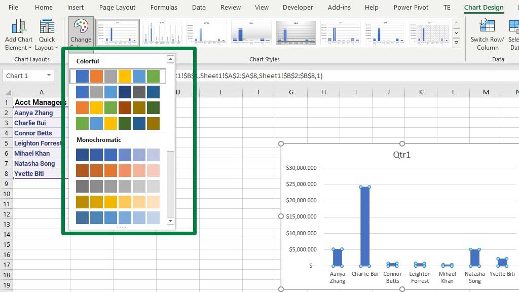
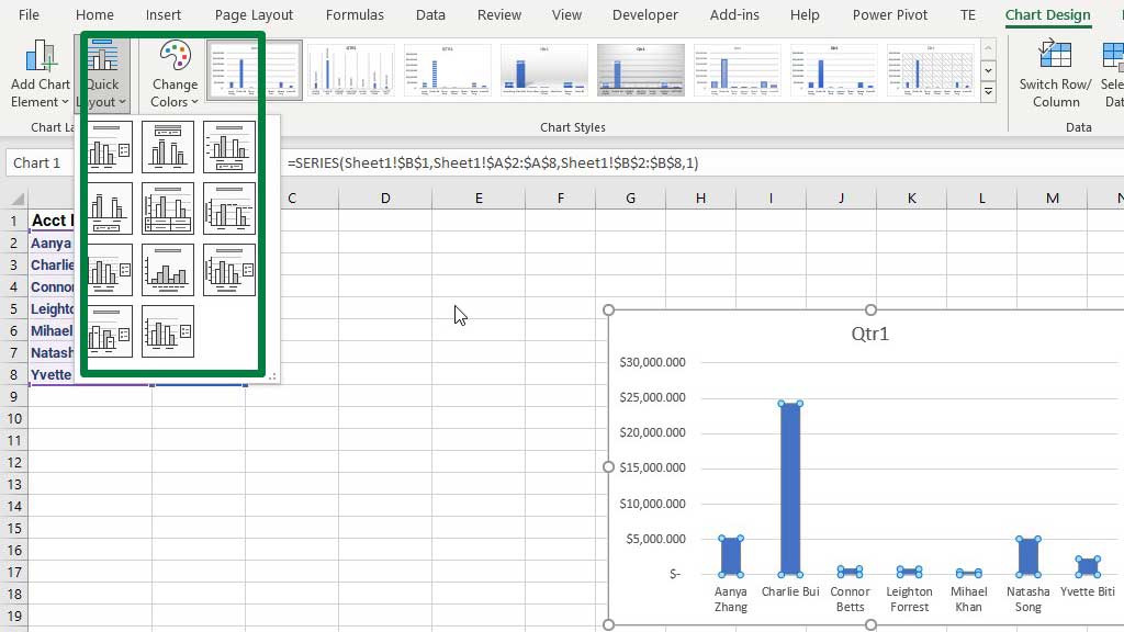
There are quite a few options to choose from. Another interesting feature is the Quick Layout option from which you can change the layout of the chart.
There are layouts with legends, with or without gridlines, tabular data labels, etc. Choose the one you feel most comfortable with or as per your requirements.
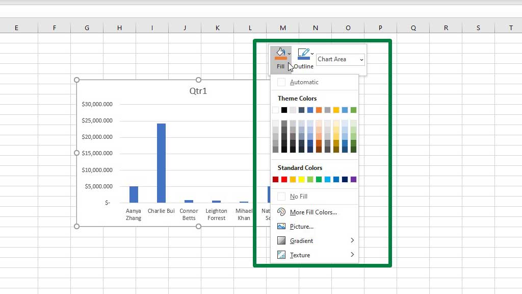
You can also customize the background and the bar colors if you want. Just select the background or the bars (if you select the background, the background color will change and if you select the bars, the color of the bars will change) then right-click and choose your preferred color from the Fill option. The Outline option will also let you control the weight and color of the borders.
You can also delete the gridlines by just clicking on one gridline and pressing delete.
So, this is how you change the chart style in excel.
Conclusion
Chart styles are of secondary concern for a data analyst, however very important nonetheless. A good chart style can gain more attention and increase the chances of being noticed.
Hence, knowing about chart styles is important.
As now you know how to change a chart style in excel, you can easily create beautiful graphs and charts and make your data more noticeable.

Hi there, I am Naimuz Saadat. I am an undergrad studying finance and banking. My academic and professional aspects have led me to revere Microsoft Excel. So, I am here to create a community that respects and loves Microsoft Excel. The community will be fun, helpful, and respectful and will nurture individuals into great excel enthusiasts.