
Excel can be used to solve various mathematical or data related problems. Moreover, those solutions can be displayed or illustrated in the form of charts or graphs which are dynamic.
There is a tool in excel which is called smart charts which can also be used to illustrate diagrams, processes, matrices, etc.
One such key diagram is known as the Venn Diagram.
So, today we will see how to create a Venn Diagram in excel.
What is a Venn Diagram?
A Venn Diagram uses circles to illustrate the relationship among a group of things or otherwise known as sets.
Venn Diagram is used to show commonality between sets. Overlapping circles show commonality while individual circles show distinct characteristics of a group.
In excel, you can make a Venn Diagram to better visualize different traits of particular groups.
So, let’s see how to create a Venn Diagram in excel.
How to Create a Venn Diagram in Excel?
If you have to make sets of students who play games and want to find out which players play two or more games. Venn diagrams can be a good tool to visualize that.
You can do that in excel by creating a Venn diagram.
Step#1 Create the Sets
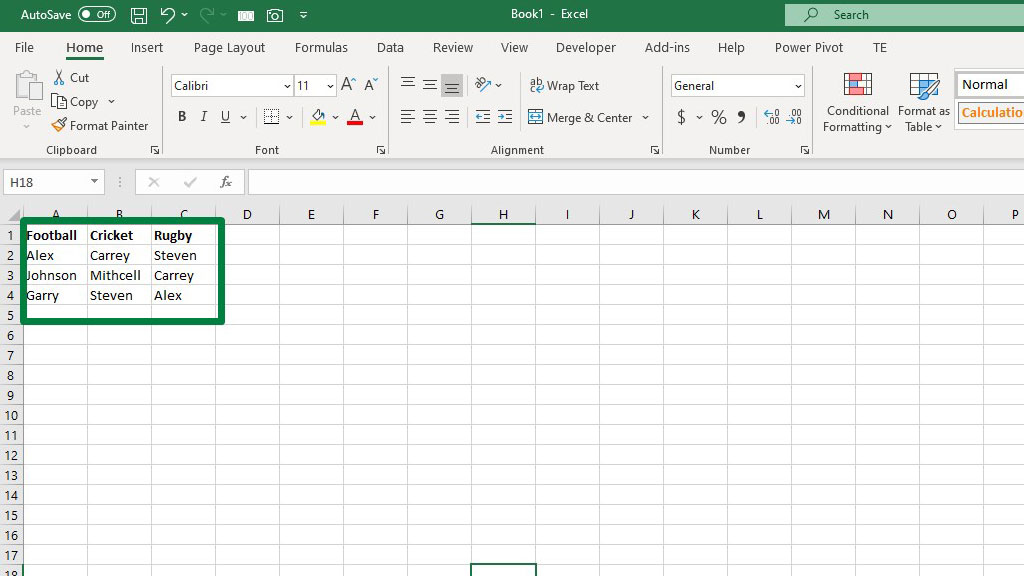
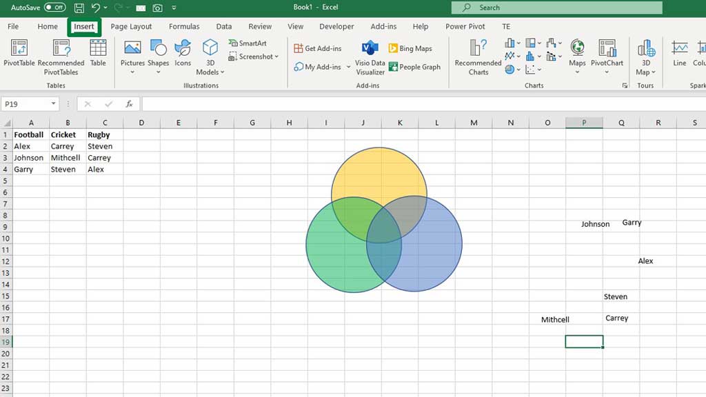
First, create a table that shows the list of students.
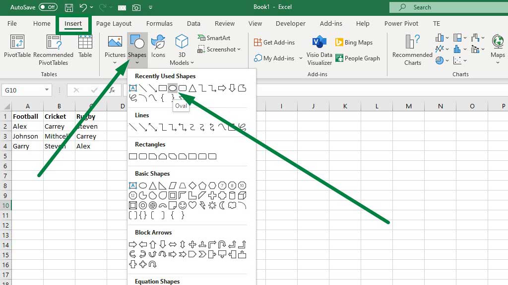
Step#2 Create the Circles for the Venn Diagram
From the “Insert” ribbon go to “Shapes” and select the oval shape.
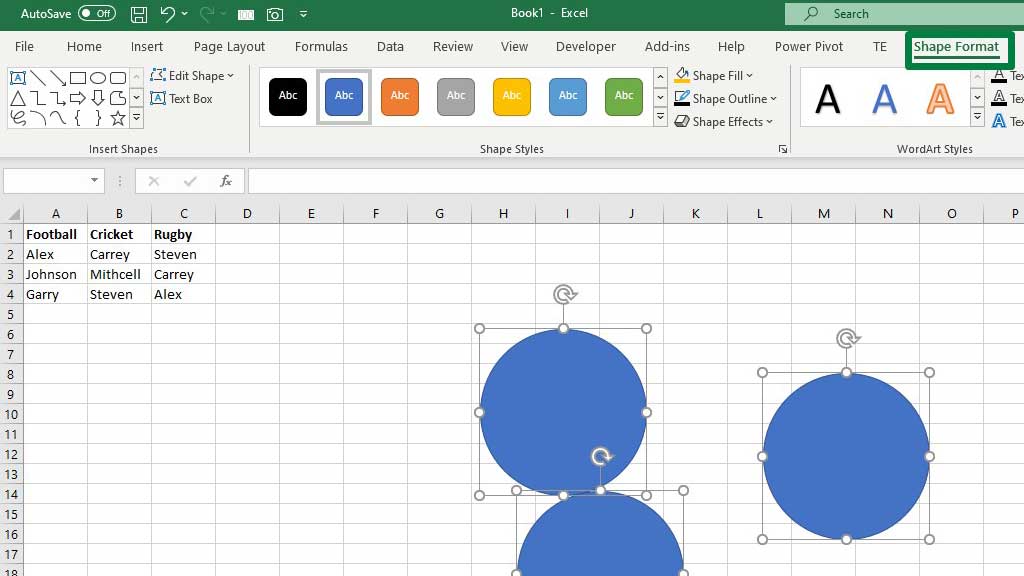
Now holding CTRL+SHIFT, use your left click to create a perfect circle. Then select the circle and press CTRL+D twice to make duplicates of the circle.
After that, select the three circles together by pressing the CTRL key and go to “Shape Formats.”
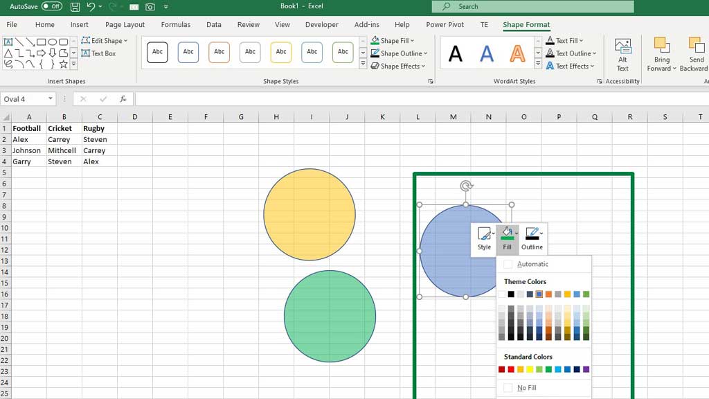
Then from “Fill & Line” increase the transparency of the circles by 50%.
Now, individually change the colors of the circles. Select a circle and then right click to Fill with your preferred color.
Step#3 Using Word Arts to Create the Names in the Sets
Now position the circles as your preference.
To input the names, you have to create Word Arts.
From, “Insert” ribbon go to “Word Art.”
Then from the “Home” ribbon decrease the size of the fonts to 12.
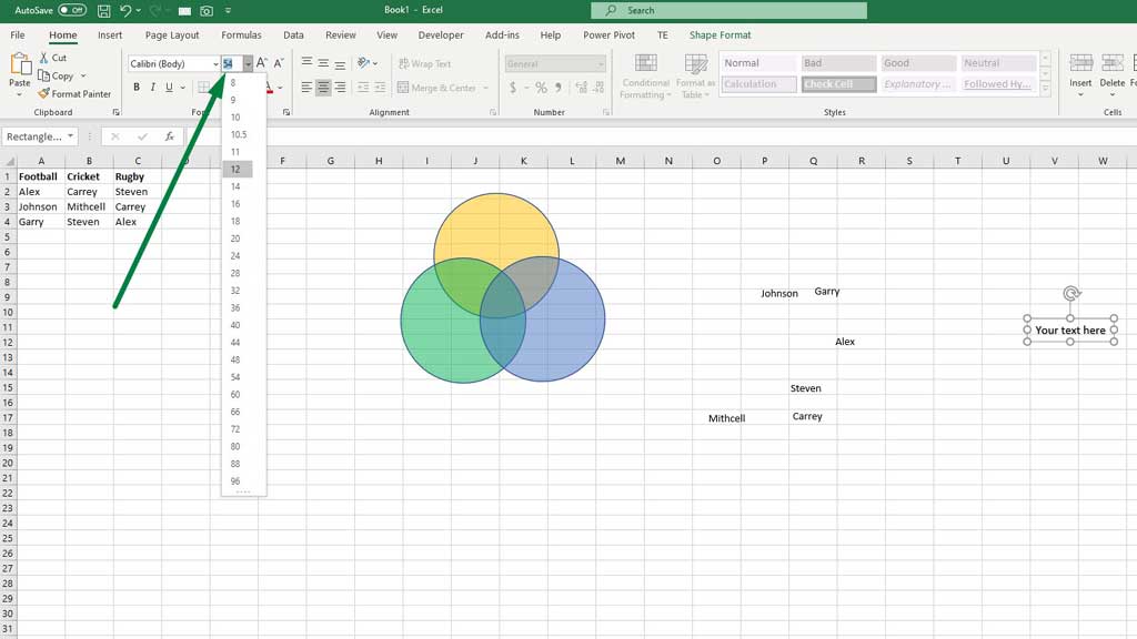
Now, press CTRL+D to duplicate and write the names.
Step#4 Inputting the Names in the Venn Diagram
Now determine the relationships and drag the word arts to their right places inside the circles.
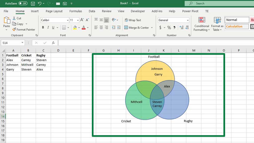
There you go, your Venn diagram is ready.
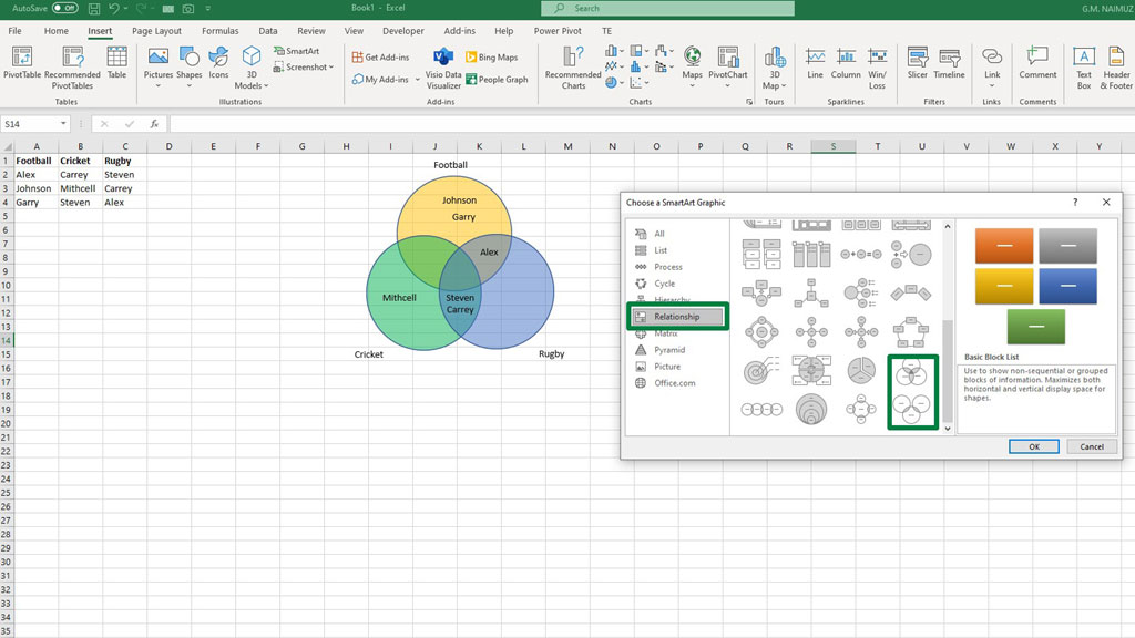
There is a tool in Excel called the Smart Charts. You can make a Venn Diagram from there as well.
From, “Insert” ribbon go to “Smart Chart.” You will see a dialogue box pop up.
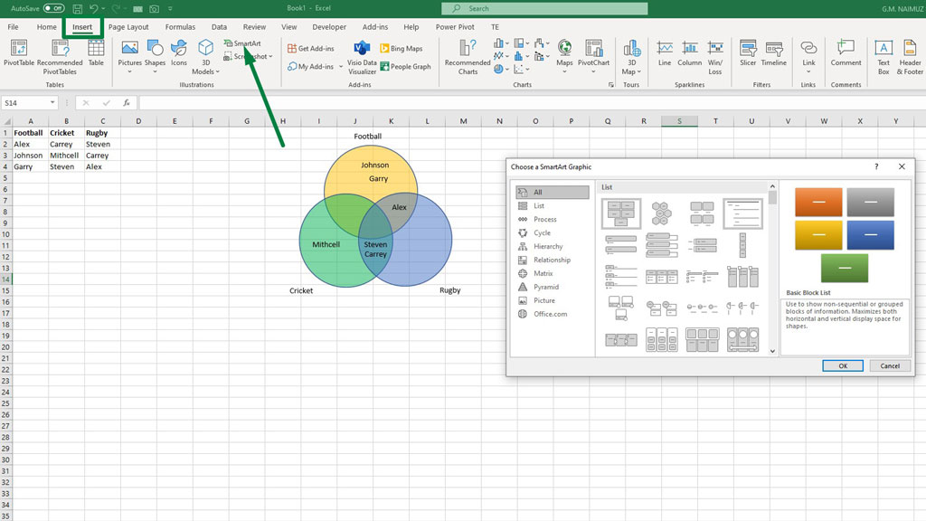
Then from “Relationships” select your preferred Venn Diagram.
But as you can see, you can’t denote the commonality in this diagram. Because you can’t place any common traits inside the common space of the circles.
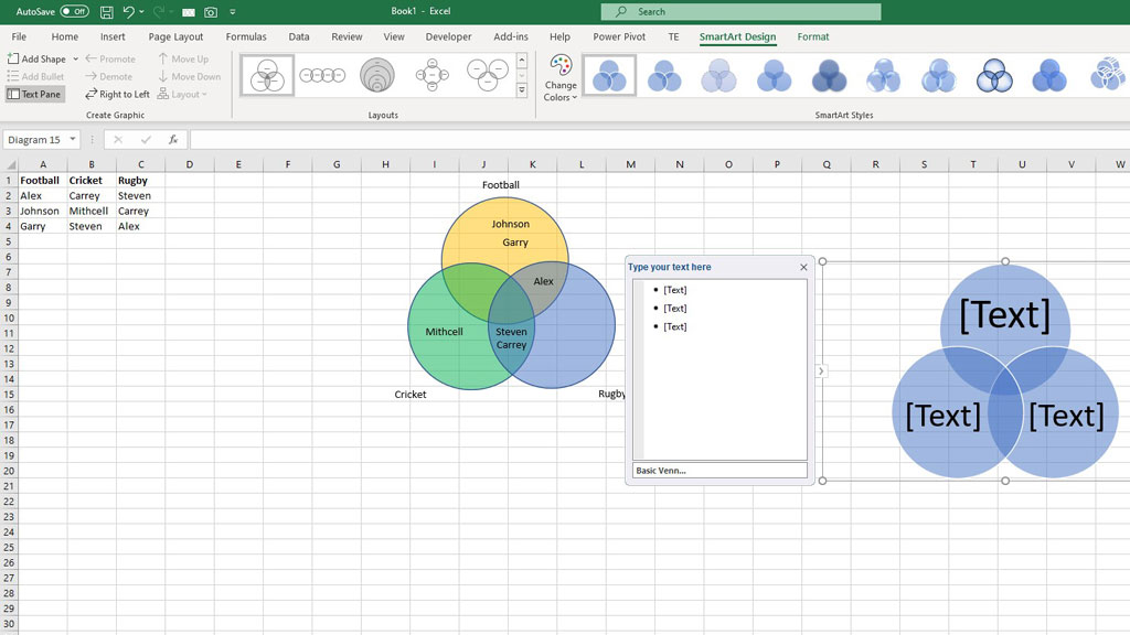
However, you still can use it if you wish for other purposes. If you want more circles just press enter and excel will add a new circle to the already existing three circles.
Conclusion
It is very difficult and time-consuming to create a dynamic Venn Diagram. It is a very advanced feature of the scatter plot in Excel.
But this manual Venn Diagram is easy to develop and, in most cases, works.
So, there you go, now you know how to create a Venn Diagram in Excel.
Related Article:

Hi there, I am Naimuz Saadat. I am an undergrad studying finance and banking. My academic and professional aspects have led me to revere Microsoft Excel. So, I am here to create a community that respects and loves Microsoft Excel. The community will be fun, helpful, and respectful and will nurture individuals into great excel enthusiasts.