
The purpose of a survey is to extract data or information from a selected specific group of people so that the information can be used to make bigger decisions or construct policies for everyone.
The methodology and characteristics of research vary depending on the field of the study, human psychology, behavior, consumption pattern, and many other things.
But the main purpose of a survey to conduct research remains the same, which is to extract and present data in a meaningful way so that policymakers can do their work in an efficient manner.
Graphs and charts are the best way to present survey results for everyone to understand. If you use graphs to present data extracted from a survey, people will understand better what you are trying to conclude.
As excel is a great tool for data analysis, graphing and charting, survey results can easily be analyzed and graphed in excel.
So, today let’s see how to graph survey results in excel.
How to Graph Survey Results in Excel?
Surveys consist of many questions. The number of questions depends on the researcher’s analytical ability and his/her purpose of the research.
However, usually, there are only two kinds of data that are extracted from a survey. Qualitative and quantitative data.
There are many methods or graphs you can use to visualize the survey results. I am going to show you the most common methods.
So, let’s see how to graph survey results in excel.
#1 Graphing Quantitative Survey Results Individually in excel
Quantitative surveys are usually conducted on a scale. The most popular scale used is called the Likert scale.
The Likert scale is a five, seven, or nine-point agreement scale used to measure respondents’ agreement with various statements.
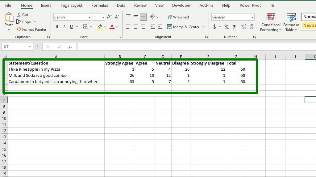
You can see an example of the quantitative survey in the picture. The survey used a Likert scale of 5 units to extract data from 50 respondents.
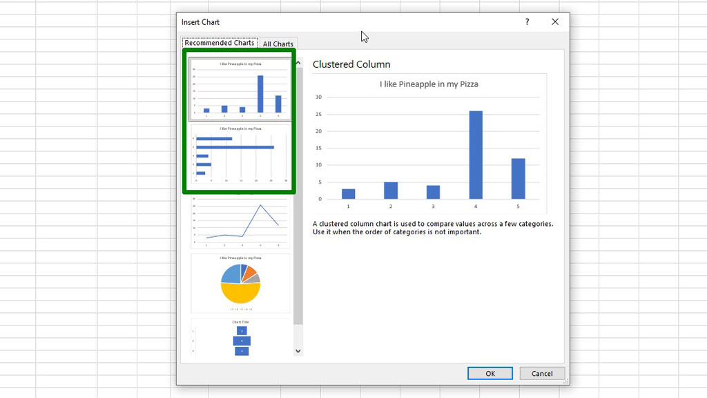
To graph the survey results individually for each statement or question, you can use a bar or column chart in excel.
First, select a statement or question with the respondents’ answers, then from the Insert ribbon go to Recommended Charts and select a bar or column chart.
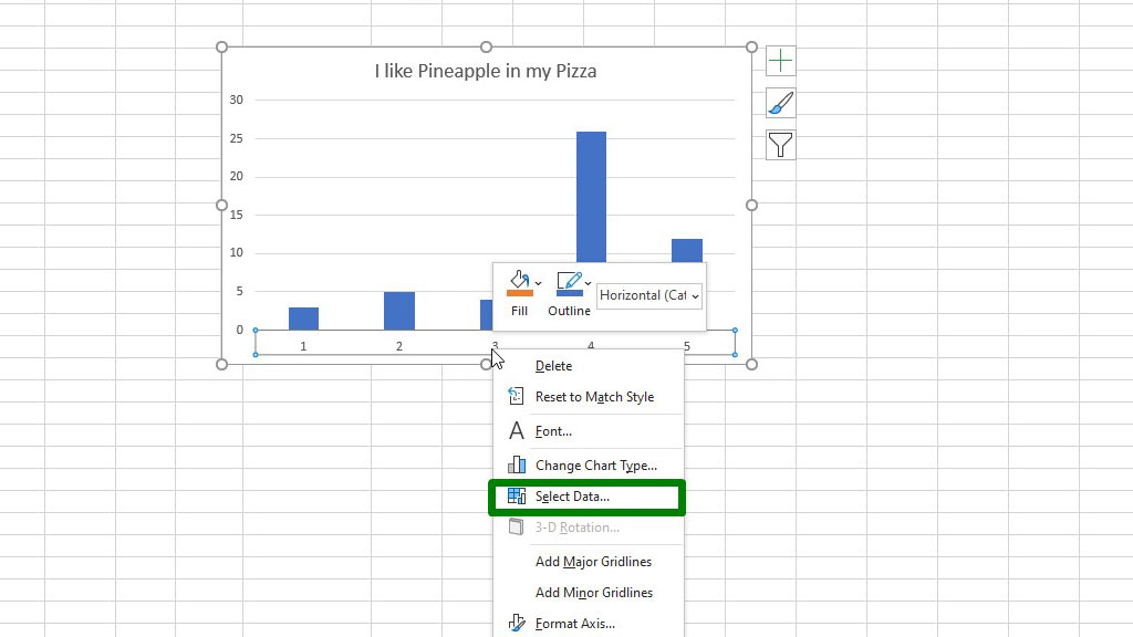
If you notice, the horizontal axis labels are not right. To fix that, select the horizontal axis, right-click, and select Select Data.
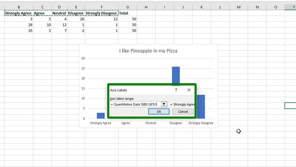
You will get a dialogue box, from the Horizontal (category) Labels, go to Edit. You will get another dialogue box, in that box for the Axis label range select the Likert scale measuring units (Strongly Agree, Agree, Neutral, Strongly Disagree, Disagree).
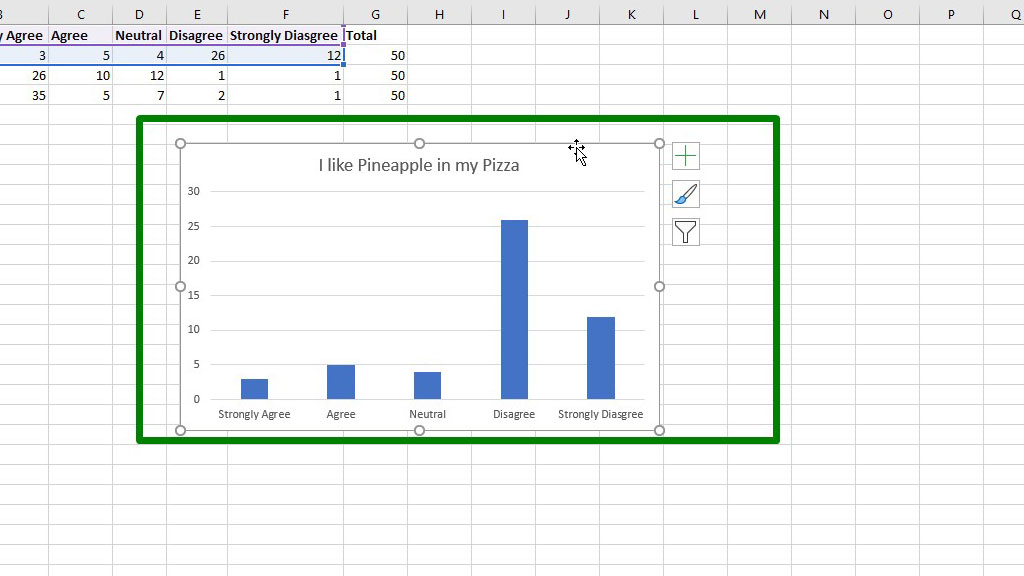
Press ok and you will see that the axis labels have been changed to proper ones.
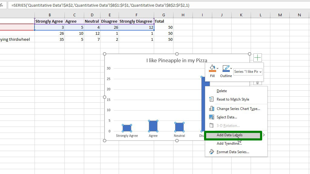
You can also add data labels, by right-clicking on one of the bars and then select Add Data Labels.
#2 Graphing Quantitative Survey Results in excel All Together (Summarizing Survey Results in a Graph)
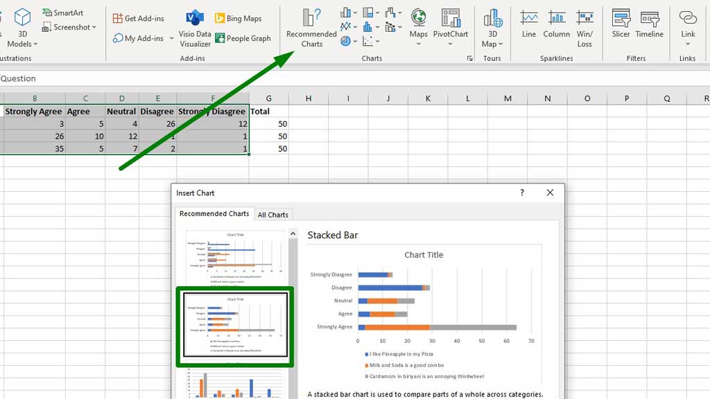
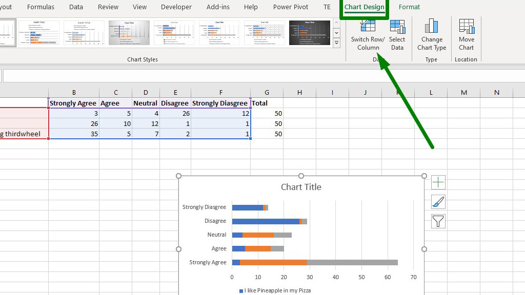
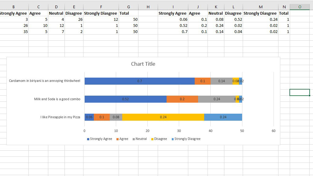
Now, if you want all the statements or questions in the survey in a single graph, that is also possible. You will need to use a stacked column or bar chart.
First, select all the statements or questions with the respondents’ answers, then from the Insert ribbon go to Recommended Charts and select a stacked bar or column chart.
However, the graph is not quite right. The colors represent the statements or questions. If the colors represented the feedback or answers from the respondents’ the graph would look much better.
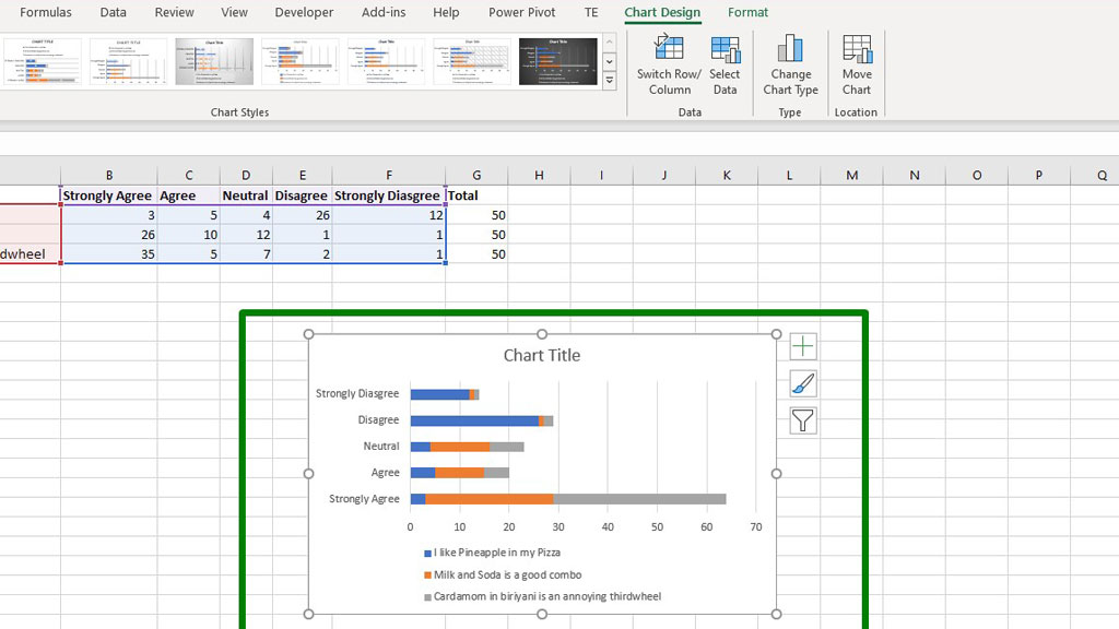
So, to reverse the data, just select the graph and from the Chart Design tab select Switch Row/Column.
Now, the graph looks much better.
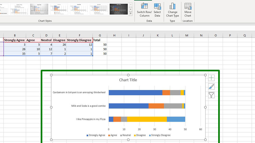
Like the previous method, you can add data labels as well.
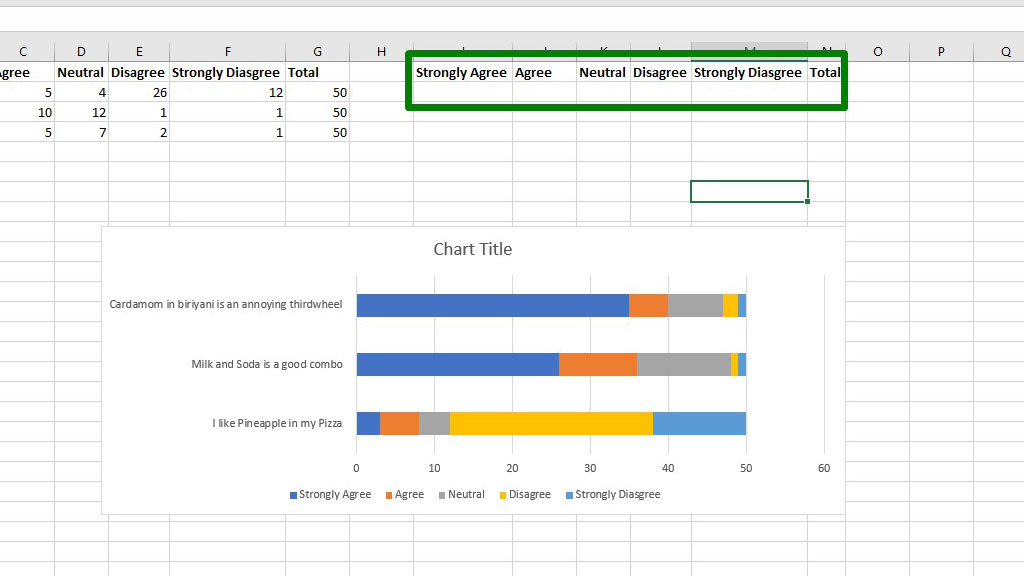
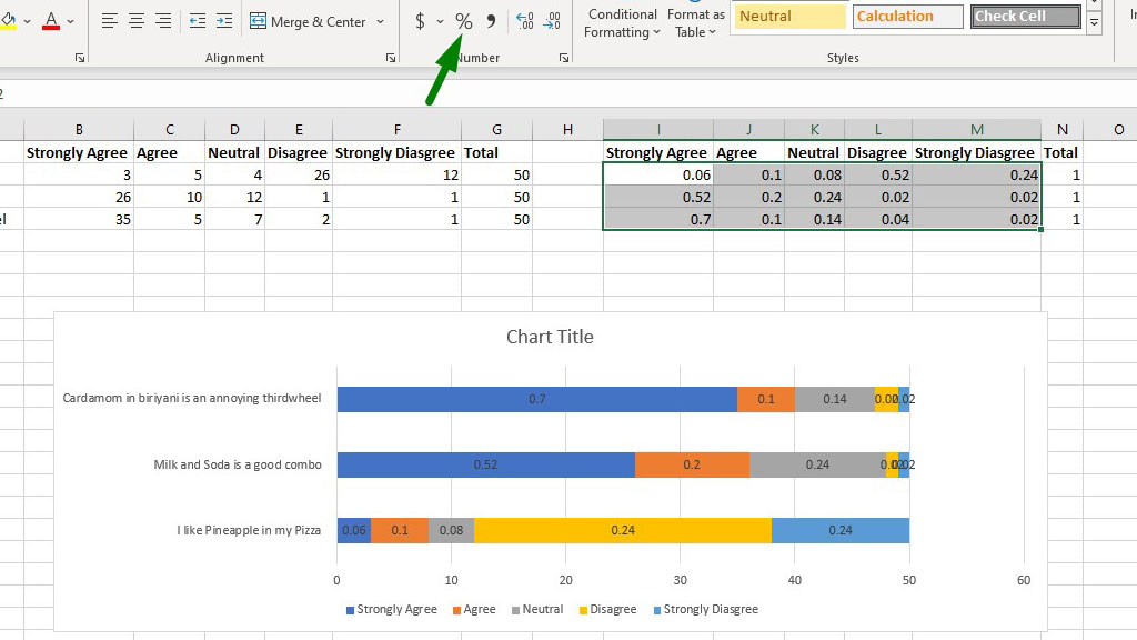
Usually, people prefer percentages. Because percentages refer to a broader perspective of what the data tells.
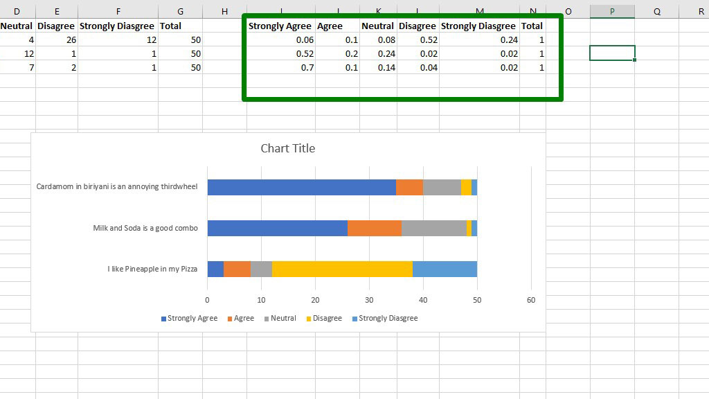
To display the percentages in the survey results, you first need to calculate them.
To calculate percentages, first copy the labels in a different row.
Now, type the following formula under Strongly Agree:
=B2/$G$2
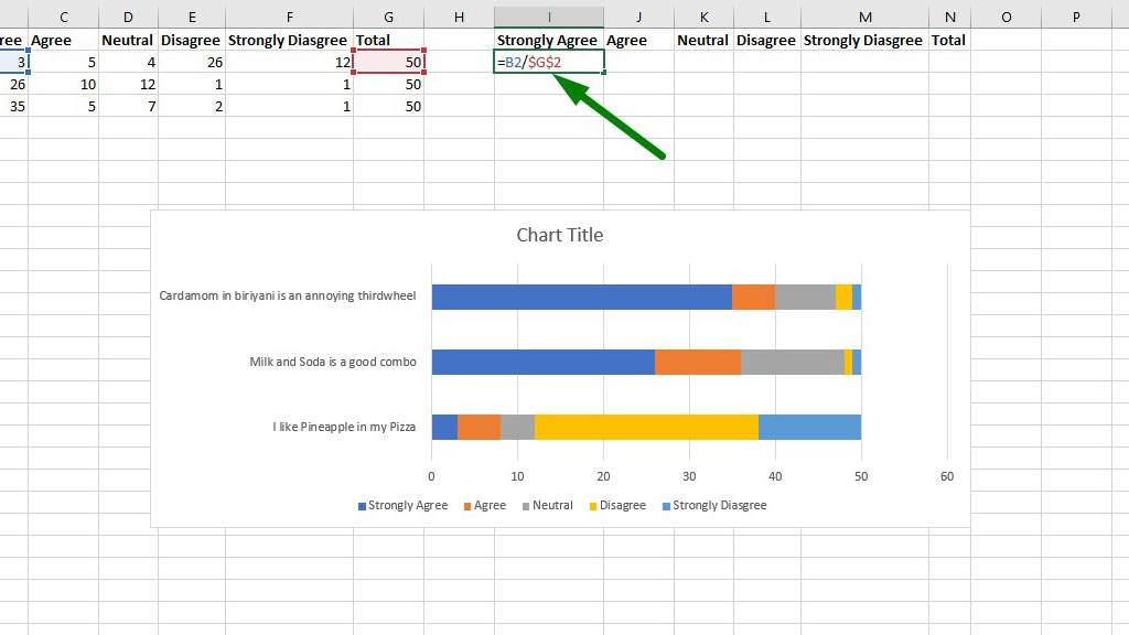
Now, drag the fill handle down and across to complete all the percentage calculations.
Now, it’s time to display the percentages in the graph of the survey results.
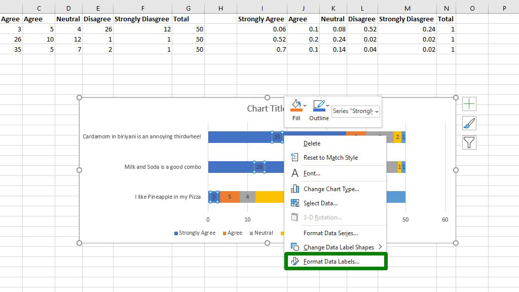
To do that, add data labels. In this case, select each stack of bar or column, right-click, and add data labels.
As there are 5 stacks of bars or columns, you need to do that process five times.
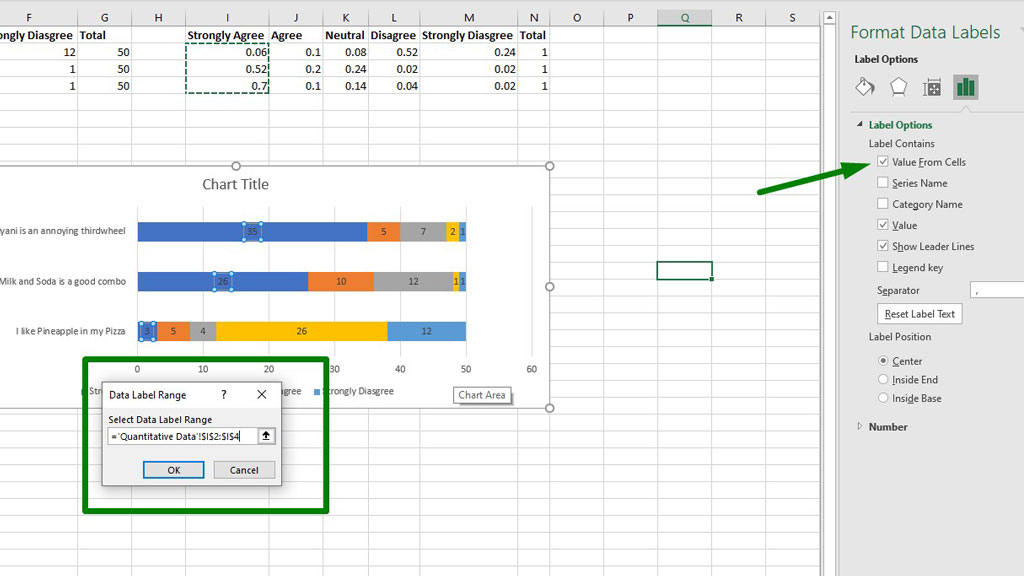
Now, select one of the data labels, right-click, and select Format Data Labels.
You will see a menu popping from the right. From that menu, enable Value from Cells and select the percentage values. Be careful when you select the percentage values, select the ones referring to the right feedback or answer.
Unselect the Value option and you are good to go.
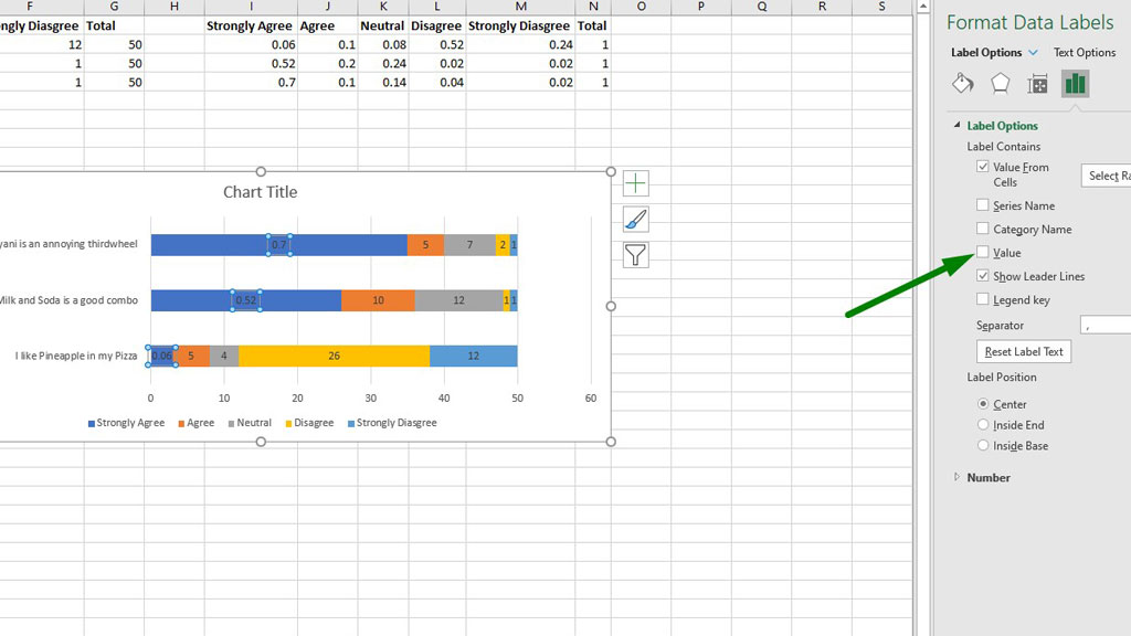
Now, repeat the process for all the stack of columns to get the percentage values.
I forgot to add the percentage signs. No worries, just select the percentage values and from the Home ribbon, select the Percentage number format.
So, there you go your survey results have been graphed in excel.
If you feel like the color of the texts or the bars are not looking beautiful or comfortable to the eyes, you can change them according to your requirements.
#3 Graphing Qualitative Survey Results in excel
Qualitative or categorical data is also frequently used in surveys. Qualitative data can be gender, educational qualification, favorite colors, political inclination, etc.
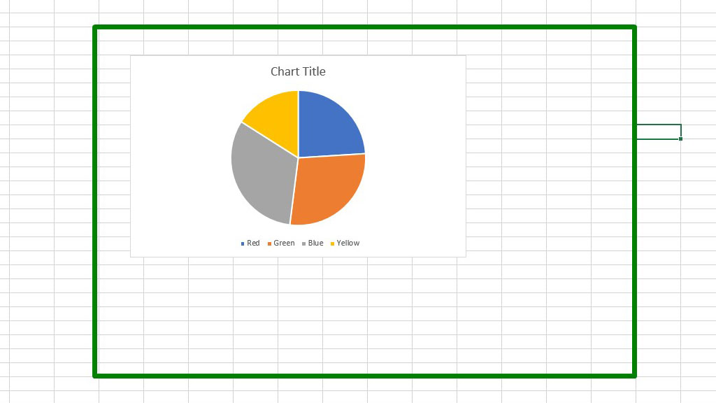
To graph qualitative survey results in excel, usually, circle or pie charts are used.
In the picture, you can see that 50 respondents were asked about their favorite color. This is an example of qualitative data.
To graph, the survey results in excel, first select the data, from the Insert ribbon go to Recommended Charts and select a pie chart.
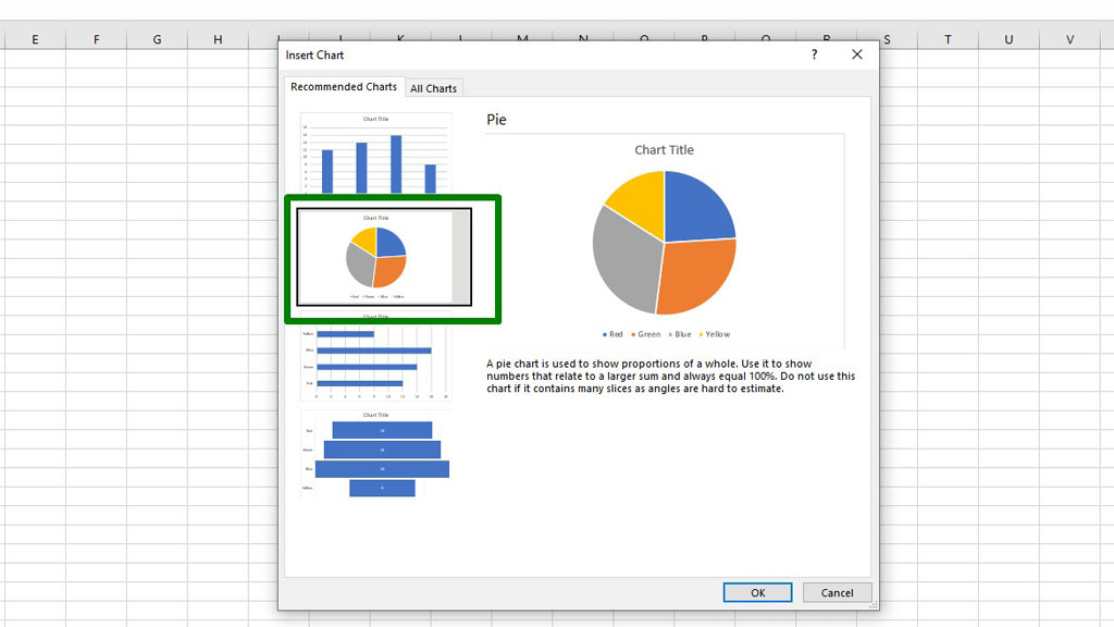
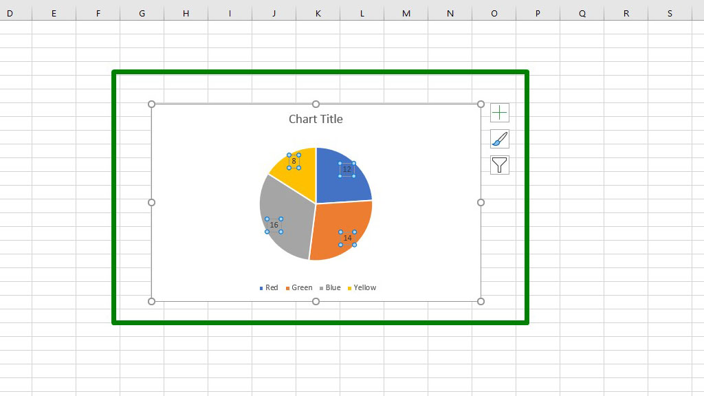
Press ok and you will see that the pie chart has been created.
Add the data labels.
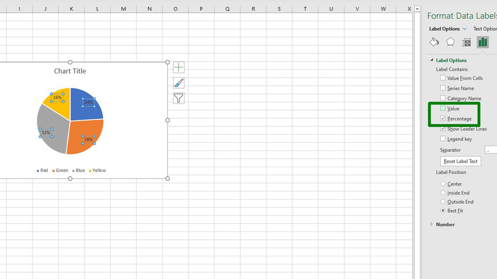
To add the percentage, you do not have to calculate them separately as we did for the stacked column or bar chart.
In the Format Data Labels option, enable the Percentage option and disable the Value option to display the percentage values.
So, there you go now you know how to graph survey results in excel.
Conclusion
Whether you are a student or a researcher, at some point you have to conduct surveys to extract data. Properly presenting and visualizing data to present your findings coherently is as important as knowing how to conduct proper research.
So, as now you know how to graph survey results in excel, you have got the presentation part covered. We hope you conduct great research to find extraordinary things.

Hi there, I am Naimuz Saadat. I am an undergrad studying finance and banking. My academic and professional aspects have led me to revere Microsoft Excel. So, I am here to create a community that respects and loves Microsoft Excel. The community will be fun, helpful, and respectful and will nurture individuals into great excel enthusiasts.