
The graphing and charting tools in excel have a wide range of implications in data analysis.
There are stacked column charts for different categories of data series, burndown charts for project management, supply and demand graphs for economics professionals, and many more.
You can get really creative with charts and graphs in excel and summarize and present data in a way that is easy to understand and visually appealing.
Today we are going to learn about another graph in excel which is the circle graph or widely known as the pie chart.
Creating pie charts in excel is very easy.
So, let’s see how to make a circle graph in excel.
What is a Circle graph or a Pie Chart?
A circle graph is more widely known as a pie chart. As the name suggests it is a pie and the slices of the pie represent the proportion of products or items.
The whole pie is 100% and the slices make various proportions to finally create 100% of the pie.
I am going to show you two pie charts or circle graphs in excel and analyze in what ways they are helpful.
So, let’s see how to make a circle graph in excel.
How to Make a Circle Graph in Excel?
You can only graph one category in a pie chart.
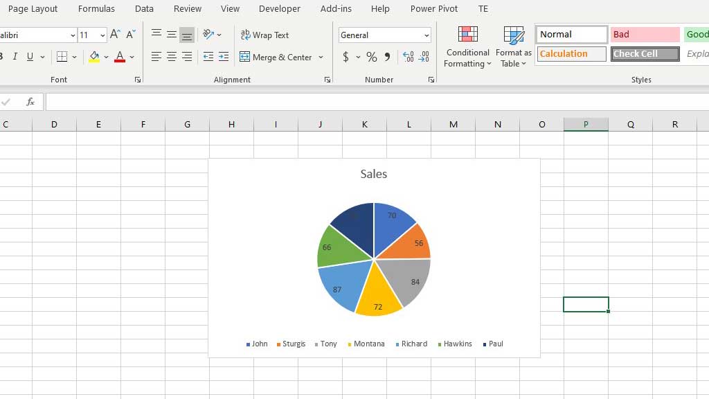
So, for example, let’s make a circle graph or a pie chart of sales figures of different salesmen.
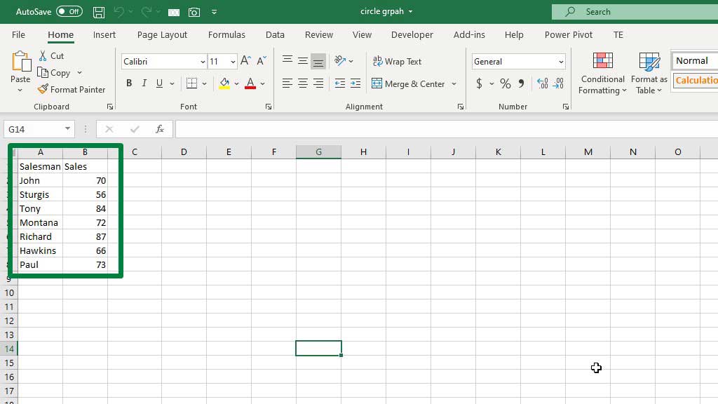
You can see that in the picture there are 7 salesmen with different sales figures.
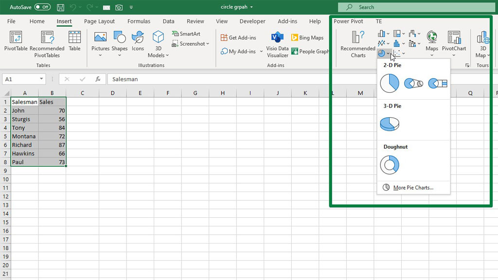
Select both the columns and go to the Insert ribbon. From the Charts section select the Pie Chart.
You will see that a 2-D pie chart has been created.
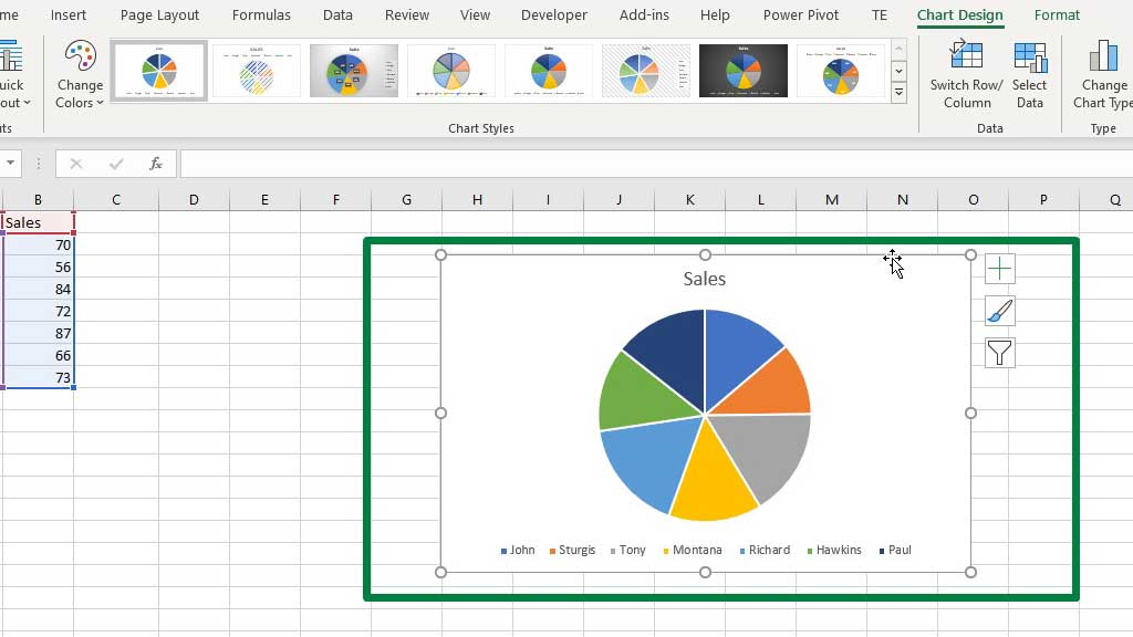
You can see that the color of the different slices of the pie or circle denotes different salesmen.
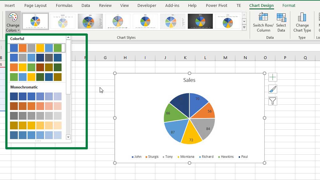
You can choose a different color from the presets.
You can also choose your preferred color for a slice by double-clicking on the slice and using the Fill Color option.
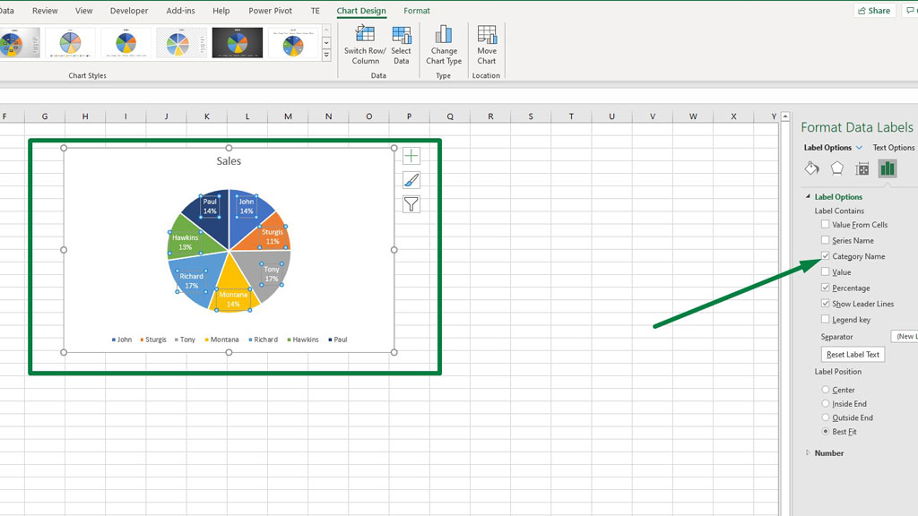
To add data labels, select the pie, right-click, and add data labels.
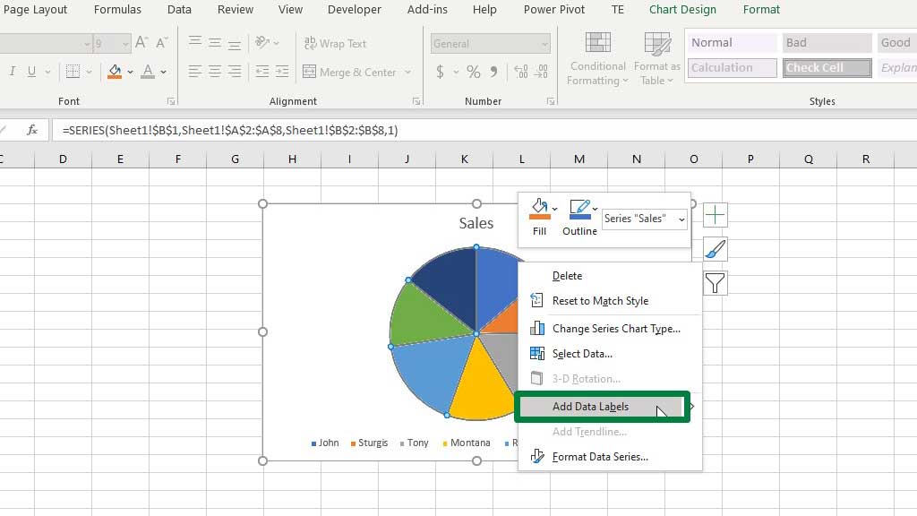
You can see that the dark colors of the slices have made it difficult for the data label fonts to be visible.
So, to change the font color of the data labels, select any of the data labels and change the color from the Font Color option.
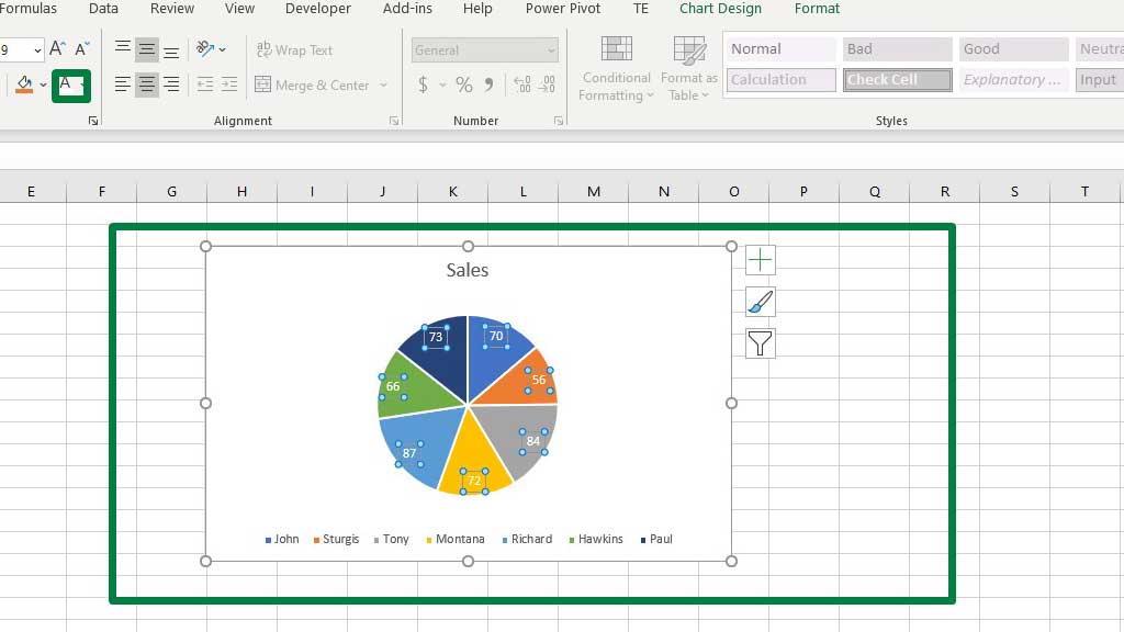
When you select a data label, the data label formatting options menu pops up on the right. There are various interesting options to choose from.
If you select the percentage option. You will see the percentage sales of each salesman.
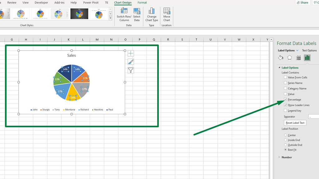
If you enable the category name, the names of the salesmen will also be displayed in their designated slice of the pie.
So, you see, pie charts are very visually distinctive and show you whose contribution is bigger or smaller.
But you can see that the size of the slices is very similar, you need to look at the numbers to get an idea of who did better.
So, this is a slight disadvantage of the pie chart or the circle graph. When the difference between numbers gets bigger, the slices get bigger as well.
Look at this chart of pets owned by people. You can easily distinguish which type of animal is mostly kept as a pet.
Conclusion
As I have stated before, graphs and charts in excel are very useful and creative. You can use them in different scenarios and portray different things.
As now you know how to make a circle graph in excel, you have added one more analysis tool to your portfolio.

Hi there, I am Naimuz Saadat. I am an undergrad studying finance and banking. My academic and professional aspects have led me to revere Microsoft Excel. So, I am here to create a community that respects and loves Microsoft Excel. The community will be fun, helpful, and respectful and will nurture individuals into great excel enthusiasts.