
In previous blogs, we have seen many graphs and charts in excel. For instance, the Venn diagram, burndown chart, supply and demand graph, stem and leaf plot, etc.
Some graphs have built-in features in excel, some are dynamic, some are not. However, the ability to use different types of graphs and charts in excel is very useful when it comes to visualizing data.
Among many graphs and charts that can be created in excel, the line chart is certainly one of the most used ones.
So, let’s see how to make a graph in excel with multiple lines.
What is a Line Graph?
A line graph is essentially a line that contains points. Those points depict the time or certain zones and value or data points in those particular time or zones.
Line graphs are very useful in displaying time or geographical zones. Multiple subcategories can also be distinctly displayed through a line graph. But mostly it is very easy to read.
So, let’s see how to make a graph in excel with multiple lines.
How to Make a Graph in Excel with Multiple Lines?
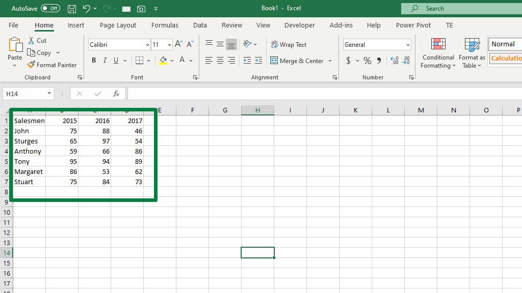
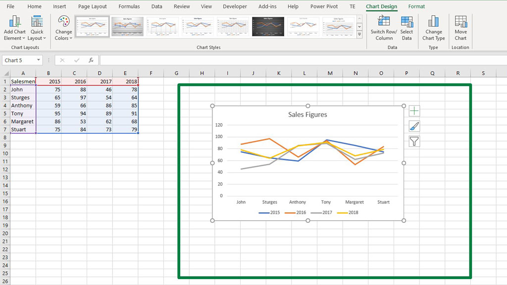
In the picture, you can see that there are six salesmen and their sales figures for consecutive years. The goal is to display the change of sales over time so that the manager can visualize their performance.
To make the multiple line graphs in excel, first, select the whole data set then go to the Insert ribbon and select Recommended Charts.
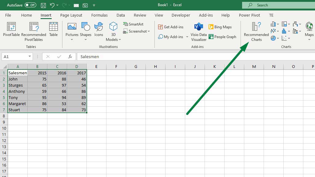
A dialogue box will pop up, from that box go to the Line Charts and select your preferred chart.
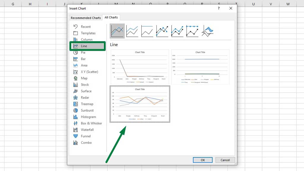
Now, press ok and you will create a graph with multiple lines in excel.
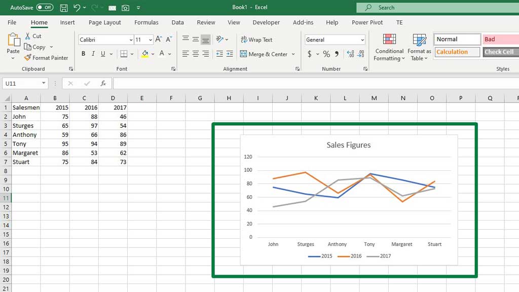
You can easily read the chart. On the horizontal axis, the salesmen are placed and on the vertical axis, the sales figures are placed. The different colors indicate the years and the legend specifies which color indicates which year.
If you want to add extra lines to this graph it is also possible and that is the efficiency and beauty of line graphs.
So, for example, new data of the year 2018 sales figures is in the system. You have to add that data to the graph.
First, select the graph, right-click, and then select Select Data.
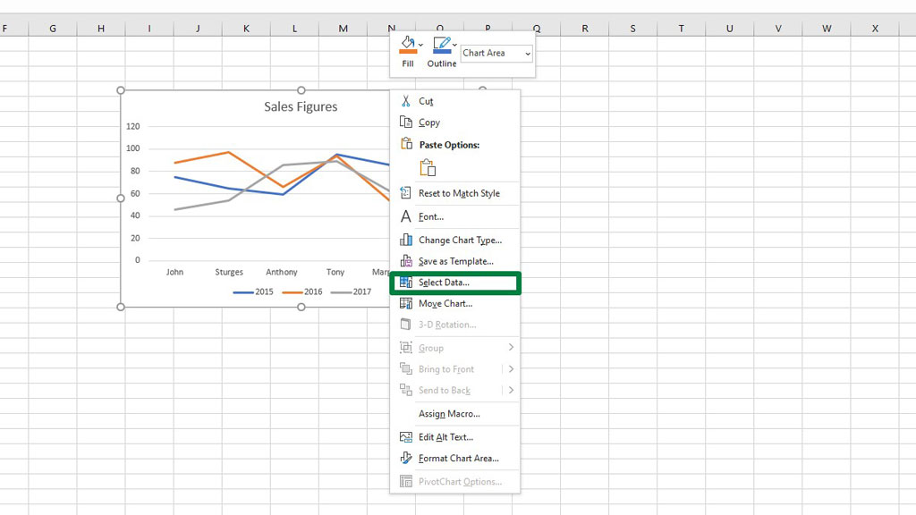
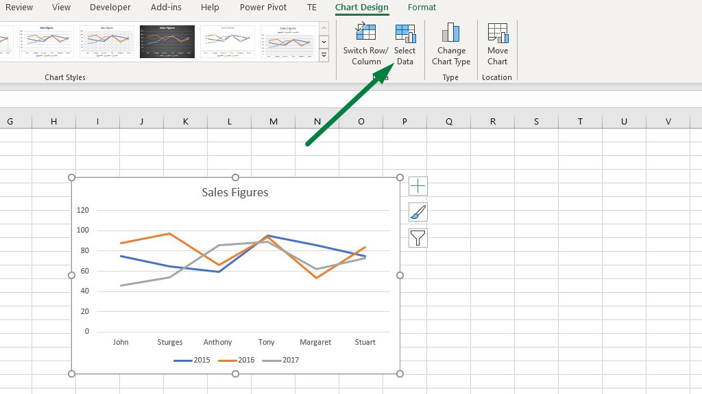
You can also choose Select Data from Chart Designs.
Now, you will get a dialogue box. From that box, select Add.
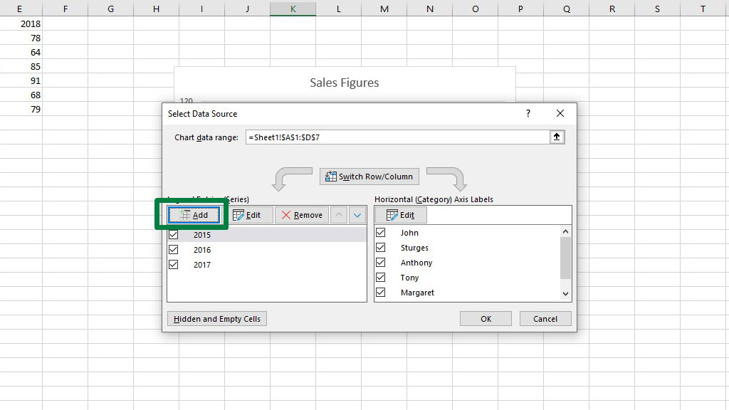
You will get another box in which you have to add the new data for the year 2018.
In the Series, Name category select the cell that contains the year 2018, and in the Series Value category select the sales figures.
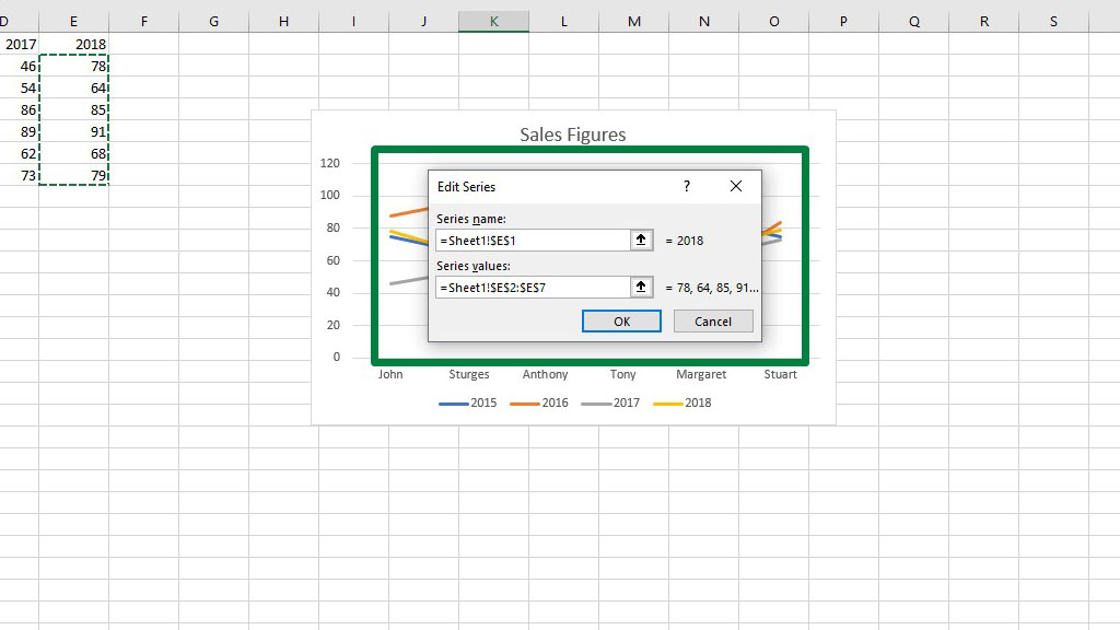
Now press ok and you will see that another line has been added to the graph which is for the year 2018.
So, there you go you have created a graph in excel with multiple lines.
Conclusion
Line graphs are used often by excel users globally in various professions. It is a very handy tool in the case of tracking time series data and realizing the change of data over time.
So, there you go as you now know how to make a graph in excel with multiple lines, you can also keep track of your year-by-year data.

Hi there, I am Naimuz Saadat. I am an undergrad studying finance and banking. My academic and professional aspects have led me to revere Microsoft Excel. So, I am here to create a community that respects and loves Microsoft Excel. The community will be fun, helpful, and respectful and will nurture individuals into great excel enthusiasts.