Microsoft Excel is a very useful tool when it comes to visualizing data. Data analysts all over the world use Microsoft Excel to visualize data by creating graphs and charts.
The chart feature in excel offers a wide range of built-in graphs and charts that can be used to visualize data and make people understand better what the data concludes.
With a little bit of tweaking, some customized and modified graphs can also be made in excel.
But today we are going to learn about another built-in graph in excel called the scatter plot.
It is a very popular graph used all over the world for its versatility.
So, let’s see how to make a scatter plot in excel with multiple data sets.
What is a Scatter Plot?
A Scatter Plot is also known as an XY plot which has points that show the relationship between two sets of data or variables.
Usually, the graph shows the relationship between a dependent variable and an independent variable. The change in the movement of the dependent variable due to the movement in the independent variable can be easily graphed through a scatter plot.
Economists and finance professionals usually work with a lot of dependent and independent variables, that’s why in excel learning to create a scatter plot is important.
So, let’s see how to make a scatter plot in excel. With multiple data sets.
How to Make a Scatter Plot in Excel with Multiple Data Sets?
Let’s assume an example of a fintech or mobile financial service. They did a survey on three independent variables.
The independent variables were cash out charge, grocery shopping discount, and saving scheme.
They wanted to test the movement of these variables against the dependent variable of cash out amount.
They wanted to find out whether increasing or decreasing the independent variables, decreased or increased the dependent variable.
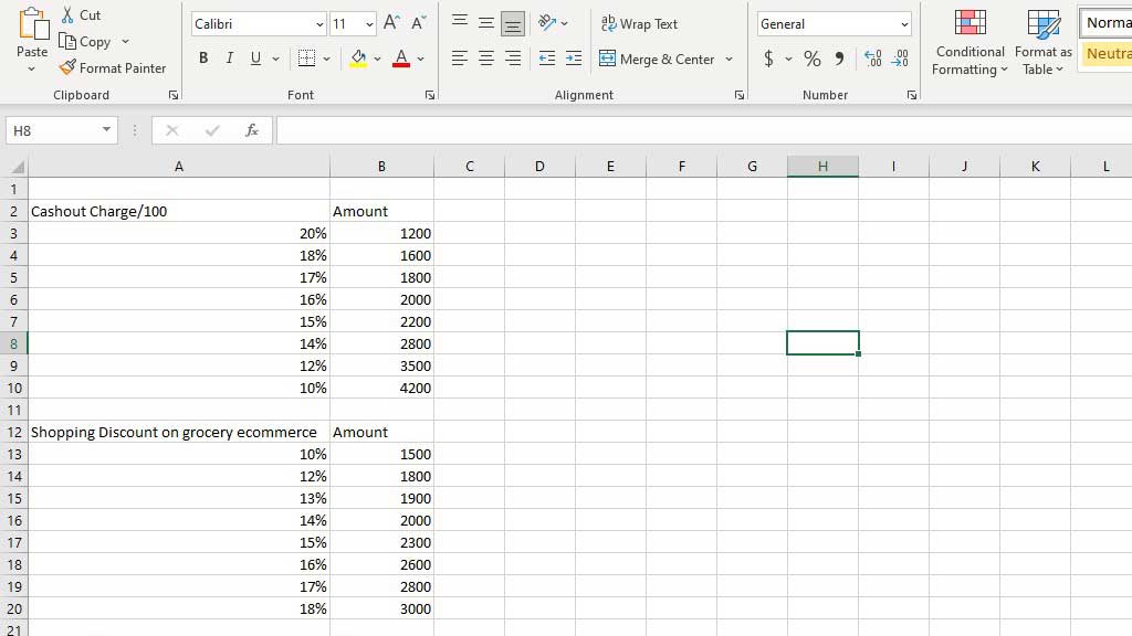
So, for the first data set, they tested the cash-out charge. To make a scatter plot, select the data set, go to Recommended Charts from the Insert ribbon and select a Scatter (XY) Plot.
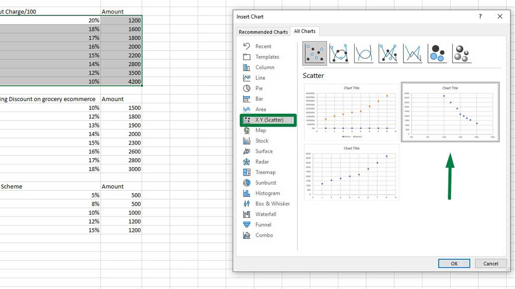
Press ok and you will create a scatter plot in excel.
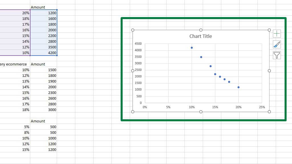
In the chart title, you can type fintech survey.
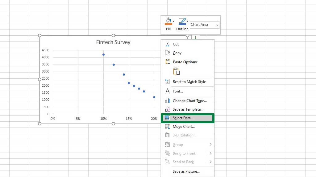
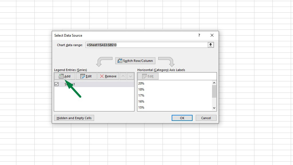
Now, select the graph and go to Select Data from the Chart Design tools.
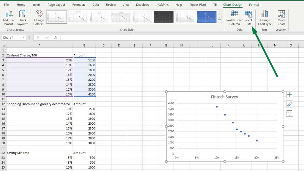
You can also go to Select Data by right-clicking on the graph.
You will get a dialogue box, go to Edit.
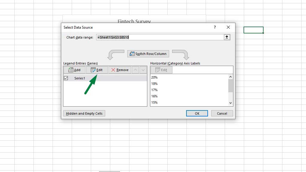
You will get another dialogue box, in that box for the Series Name select the cell that contains the title or label of the independent variable, in this case, cash out charge/100.
Press ok.
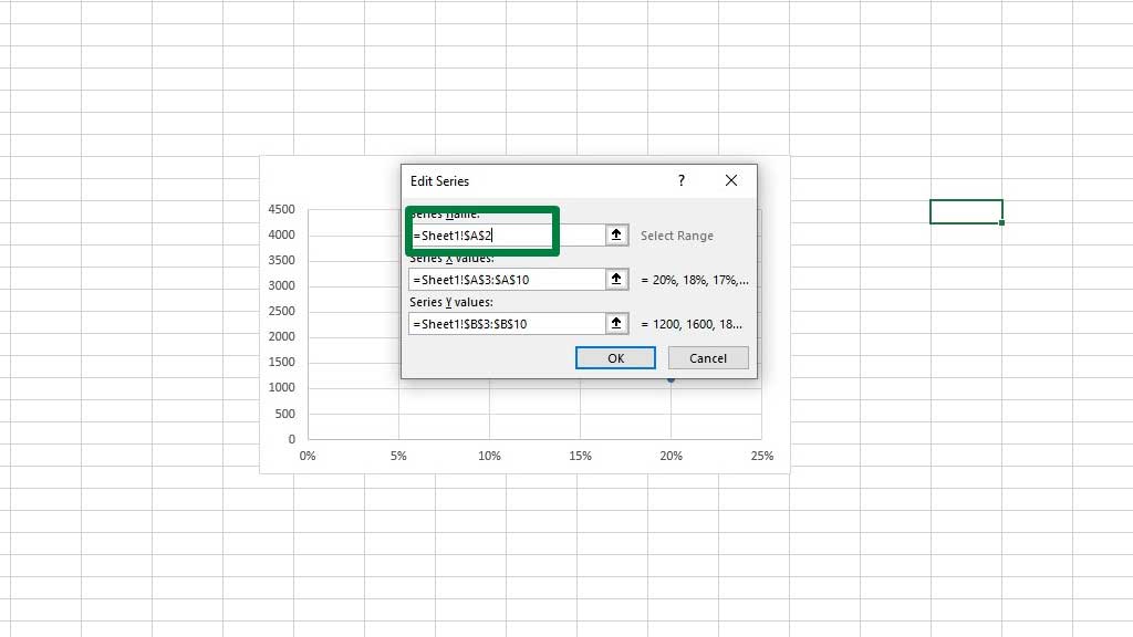
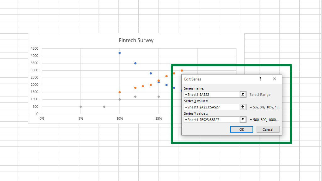
Now to add the second data set that contains the independent variable of Shopping Discount on grocery e-commerce, from the Select Data dialogue box go to Add.
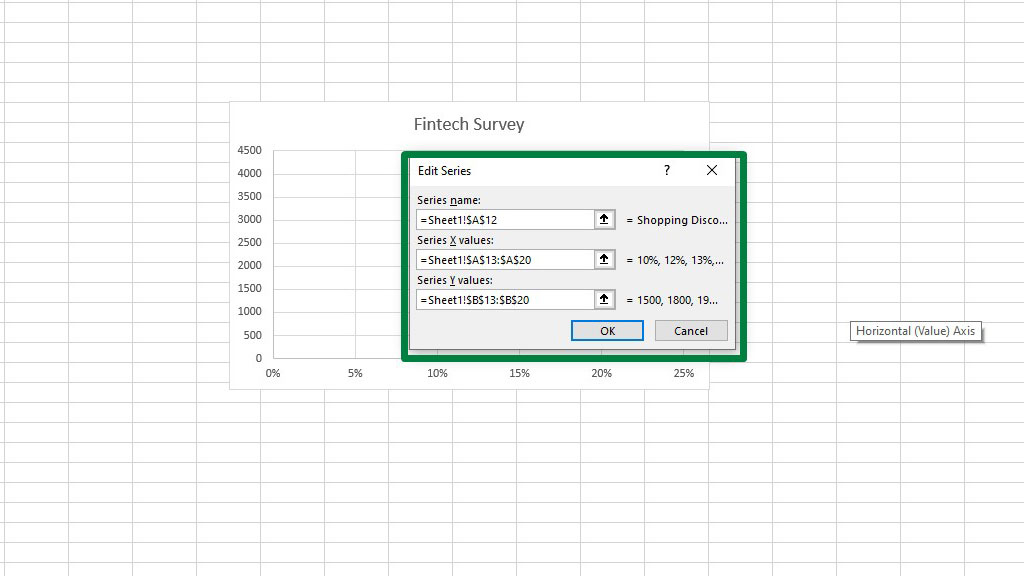
You will get another dialogue box, for the Series Name select the cell that contains the title or label of the independent variable, in this case, Shopping Discount on grocery e-commerce. For the Series X value select the column that contains the discount percentages and for the Series Y value select the column that contains the amounts.
Remember to delete all the contents (if there are any) from the dialogue box before you enter the values you select otherwise Excel will show an error or graph wrong components.
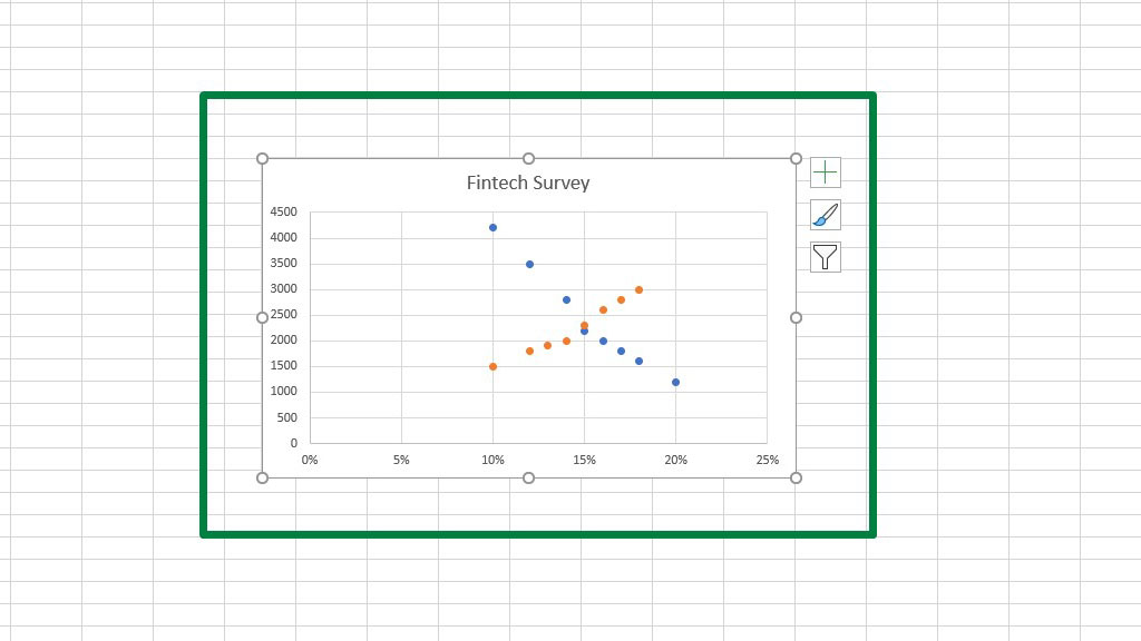
Press ok twice and you will see that the second data set has been added to the scatter plot.
There is another way you can add data sets to an existing scatter plot.
First copy the data set, select the graph and then from the Home ribbon go to Paste Special.
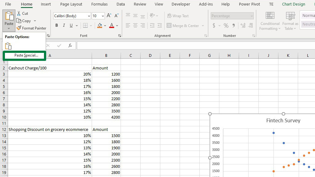
You will get a dialogue box. From that box select New Series and Category (X) values in the first column.
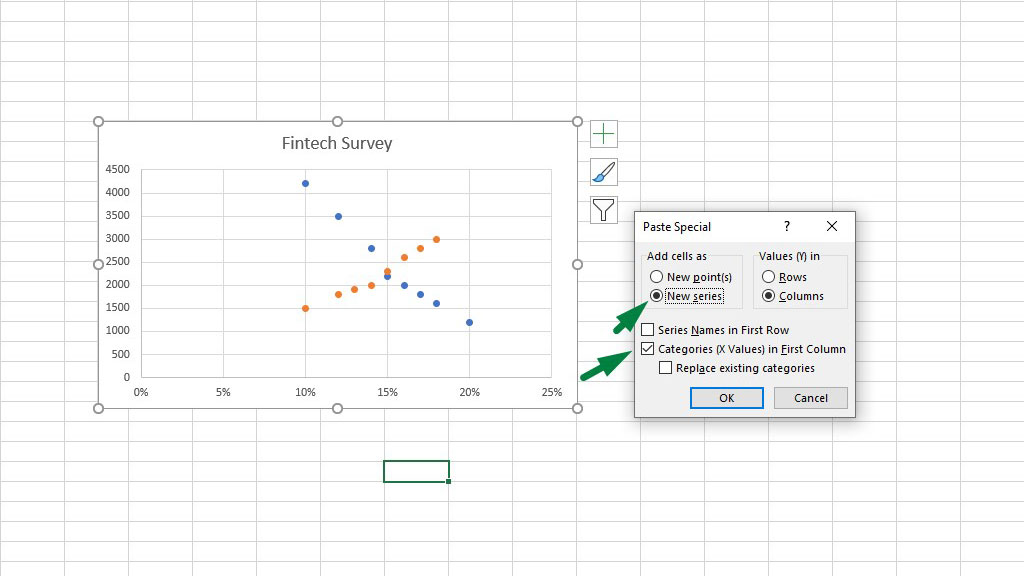
Press ok and you will see a new scatter that displays the third data set.
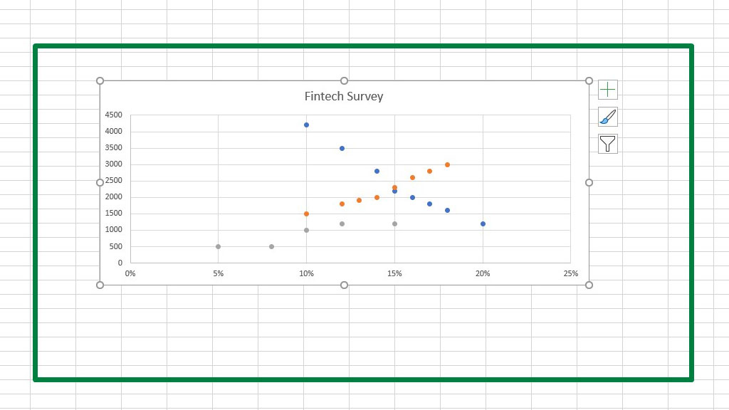
Select the last data set, go to Select Data and add the series name as we did for the first data.
Now, from the Add Chart Element select Legend.
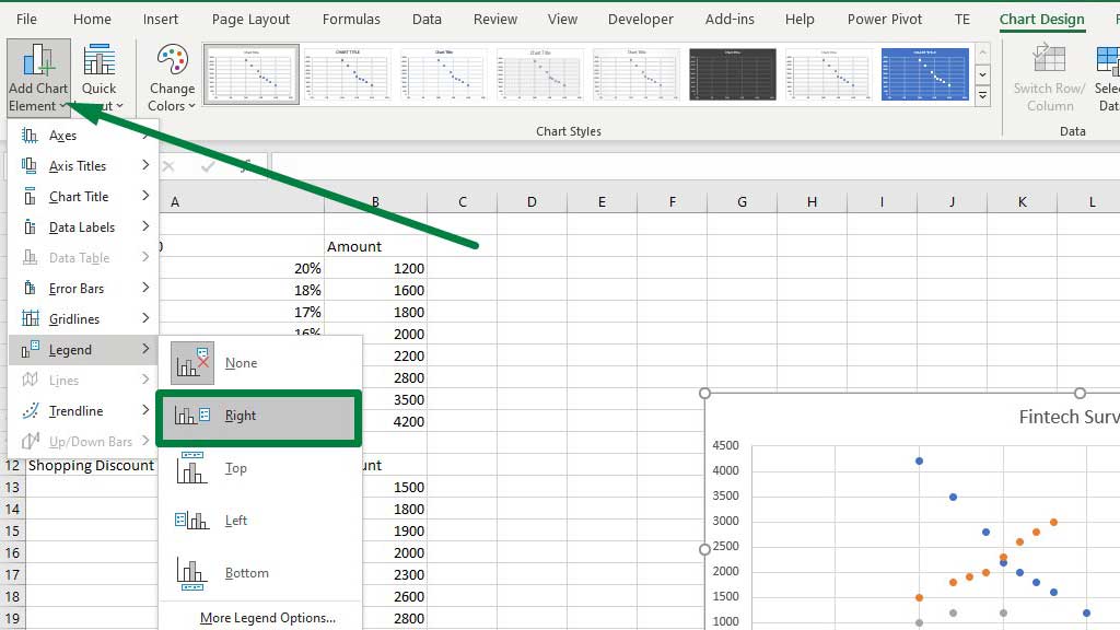
Adding legends in the graph will help distinguish the plots. According to the colors, you can distinguish the data sets.
So, there you go now you know how to make a scatter plot in excel with multiple data sets.
You can also add a trendline to the data set.
Select the graph, and from the add chart element options add a linear trendline.
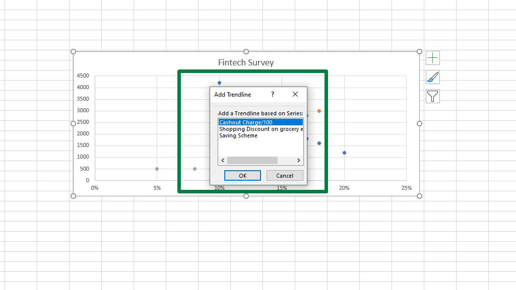
You can choose the data set for which you want the trendline. So, for the purpose of example, let’s choose a cash-out charge.
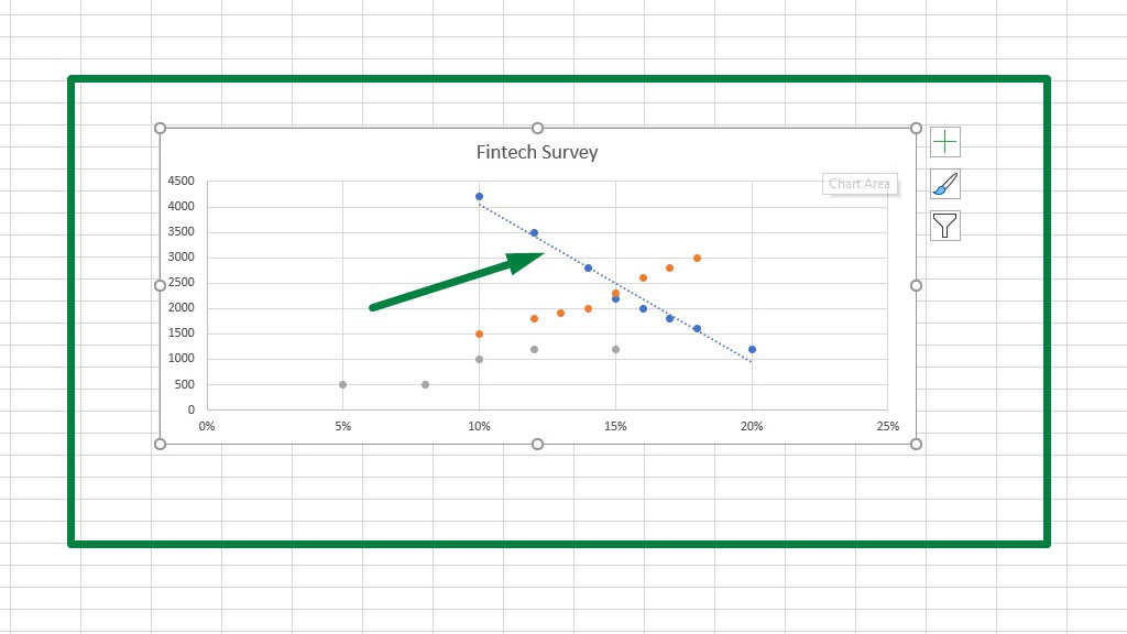
Trendlines show us a lot of things. It shows us for what amount people are willing to do what.
So, the trendline shows us that for increasing cash-out charges people decrease their cash-out amount.
So, for the company, it is prudent to keep the cash-out charge low.
Similarly, you can use trendlines for the other data sets and find out the trends. Companies can use these trends to figure out what they should do in terms of operation and finance.
Conclusion
Scatter plots are widely used for their versatility and the ability to identify trends.
As now you know how to make a scatter plot in excel with multiple data sets, you easily visualize dependent and independent variables, apply trend lines and draw conclusions and suggestions.

Hi there, I am Naimuz Saadat. I am an undergrad studying finance and banking. My academic and professional aspects have led me to revere Microsoft Excel. So, I am here to create a community that respects and loves Microsoft Excel. The community will be fun, helpful, and respectful and will nurture individuals into great excel enthusiasts.