
The use of statistics in Excel is very variegated. Statistics essentially is used to evaluate historical data and create a forecast or prediction of what might happen in the future.
This function of statistics is enabled by various tests and characteristics. One such analysis is regression analysis, and residual is a key component of regression.
As we know that, excel is useful in plotting and graphing, but not all graphs can be plotted simply like an equation. To plot residuals, you first have to calculate them.
So, let’s see how to create a residual plot in excel.
What Are Residuals?
Residuals are the difference between the observed or the actual value and the predicted value. In excel the predicted values can be retrieved by the trendline equation.
So, to calculate residuals we need first need to create a trendline the from the trendline equation we need to calculate all the expected values.
Then from the observed values, we need to subtract them and find all the residuals.
How to Create a Residual Plot in Excel?
So, let’s get started on the process of how to create a residual plot in excel.
Step#1 Input the Observed Data
First, create a table of observed values.
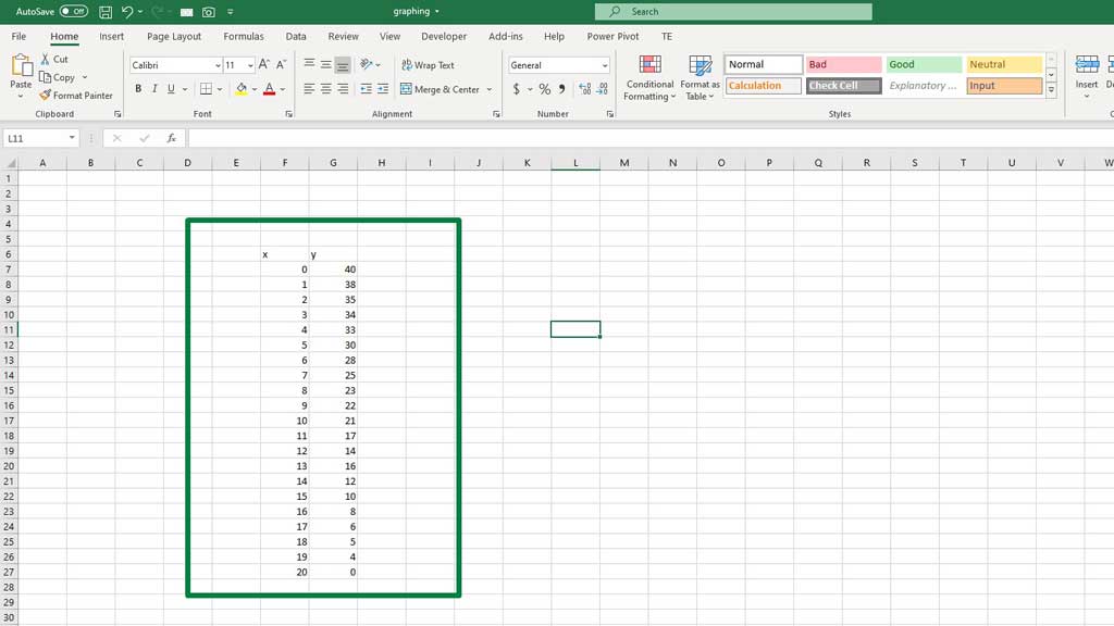
Y is the column for the observed values.
Step#2 Create a Scatter Plot for the Observed Data
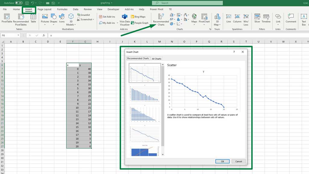
Go to the Insert ribbon and from the Recommended Charts select a scatter chart.
Step#3 Create the Trendline
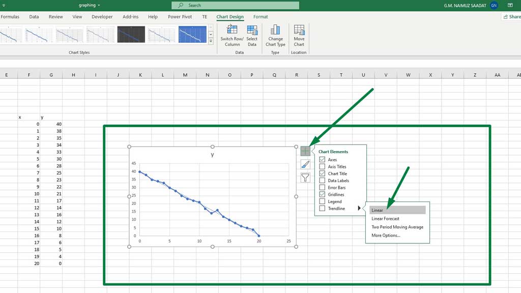
Then to add a trendline, go to Chart Elements, or from the green + sign at the top right corner of the graph, select a linear trendline.
Step#4 Display the Trendline Equation
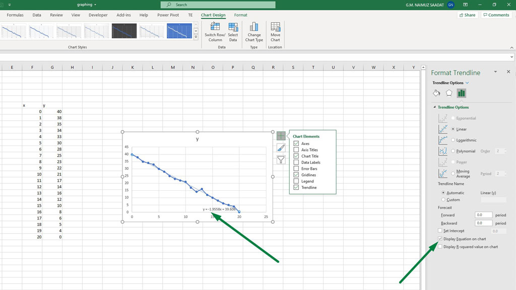
Now, double click on the trendline that has been created on the graph and you will see a Format Trendline options pop up on the right hand side.
Form those options, tick the Display Equation on Chart option, you will find that option at the bottom.
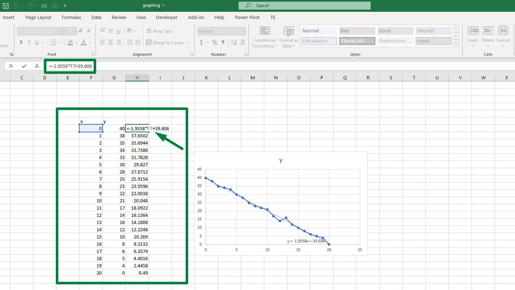
You will get an equation inside of the graph. If you notice the equation, you can compare it with the y=mx+c linear equation.
y = -1.9558x + 39.606 this is the equation you should get if you create the trendline according to the data set in the picture.
Step#5 Calculate the Expected Values
Now, to get the expected values, input the following formula
=-1.9558*F7+39.606
Then drag the fill handle down to fill all the expected values.
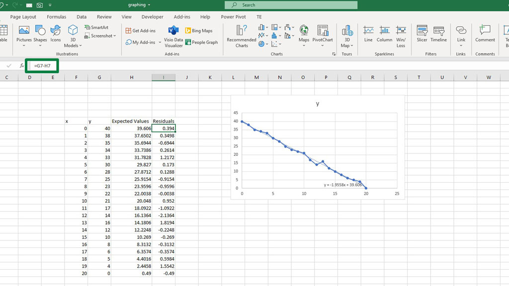
Step#6 Calculate the Residuals
Now, to get the residuals, subtract the expected values from the observed values.
Type the following formula
=G7-H7
Then drag the fill handle down to fill all the Residuals.
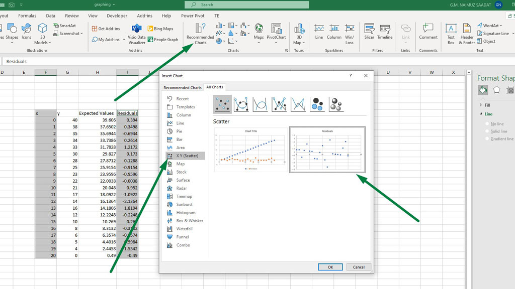
Step#7 Plot the Residuals
Select the x column and the residuals column.
Go to the Insert ribbon and from the Recommended Charts select a scatter chart. You can find the scatter chart from All Charts, and then go to X Y (Scatter).
There you have it, the residual plot in excel is ready.
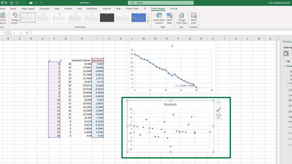
The residual plot shows the variation between the observed and the predicted data. If the plot is more scattered, it implies that the variation is very volatile. The prediction cannot be accurate.
On the other hand, if the residual plot is not that scattered and if you can identify a pattern of some sort, the prediction has a more chance of being accurate.
Conclusion
Residuals are a useful tool to measure how accurate can be your predictions. Plotting the residuals can give you a visual flair to your prediction accuracy.
So, now you know how to create a residual plot in excel.
Related Article:

Hi there, I am Naimuz Saadat. I am an undergrad studying finance and banking. My academic and professional aspects have led me to revere Microsoft Excel. So, I am here to create a community that respects and loves Microsoft Excel. The community will be fun, helpful, and respectful and will nurture individuals into great excel enthusiasts.