
Visualizing data in Microsoft Excel is easy, efficient, and appealing to the eyes. It helps people grasp the potential impact of data analysis even more.
You can graph equations and functions, make Venn Diagrams, Stem and Leaf Plots, Supply and Demand Graphs, Burndown Charts, and many more in Excel.
While there are numerous options to build various charts and graphs in excel, in some cases you need to tweak the data and design a bit to trick excel into creating a customized chart.
But Microsoft Excel’s graph and chart tools are so vibrant and versatile that, in most cases, analysts use the built-in graphs.
One such graph is the bar graph in excel.
So, today let’s learn how to create a bar graph in excel with multiple bars.
What is a bar graph?
A bar graph or bar chart consists of multiple bars displaying different categories. A bar can be horizontal or vertical.
Usually, a vertical bar graph is called a column chart or column graph.
A bar graph is very useful in comparing multiple data sets. Especially the growth rates of different data sets.
Mostly vertically crafted bars which are columns are used to display data where the horizontal (x) axis represents the categories, and the vertical (y) axis represents a value for those categories.
A bar chart can consist of multiple bars as the categories can have data from different.
So, today let’s learn how to create a bar graph in excel with multiple bars.
How to Create a Bar Chart in Excel with Multiple Bars?
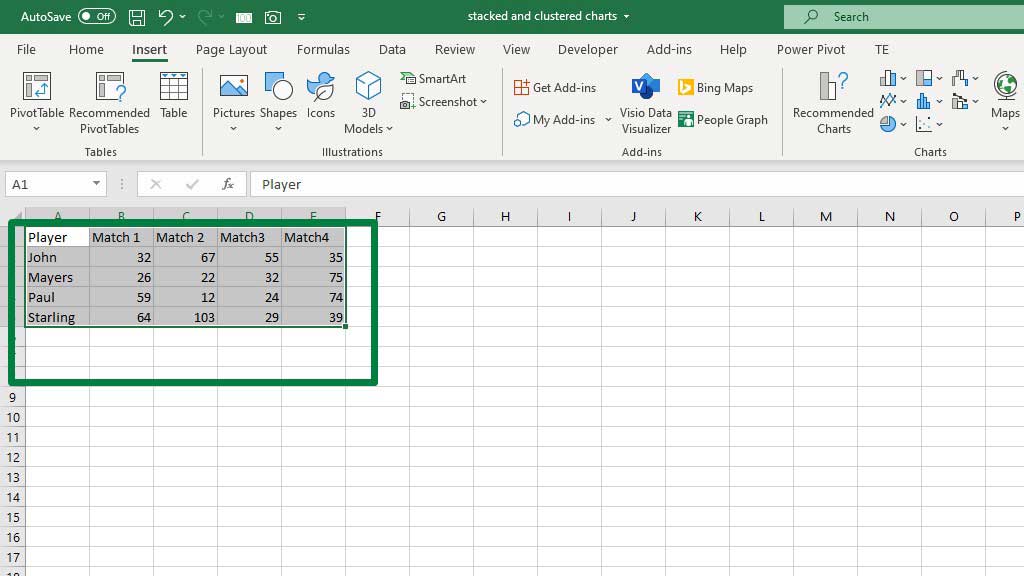
You need to set up your data first. As comparisons can be made among different groups, I have created a data set of 4 players and their scored runs in different matches.
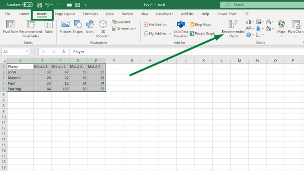
Now, to create the bar chart select the whole table and from the Insert ribbon go to Recommended Charts.
You will see a dialogue box pop up. From that box go to the bar chart and select a bar chart.
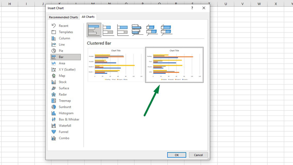
You can choose from two different bar charts. One is grouped by matches and categorized by player names.
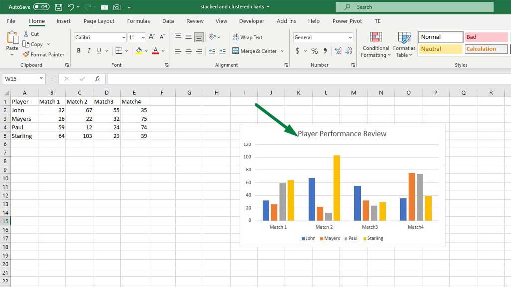
And the other is grouped by players and categorized by matches.
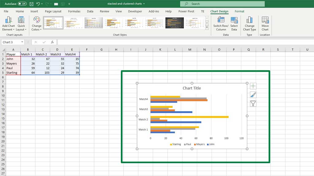
I prefer categorization by players. As the motive is to compare player performances, so the graph categorized by the players is a good choice.
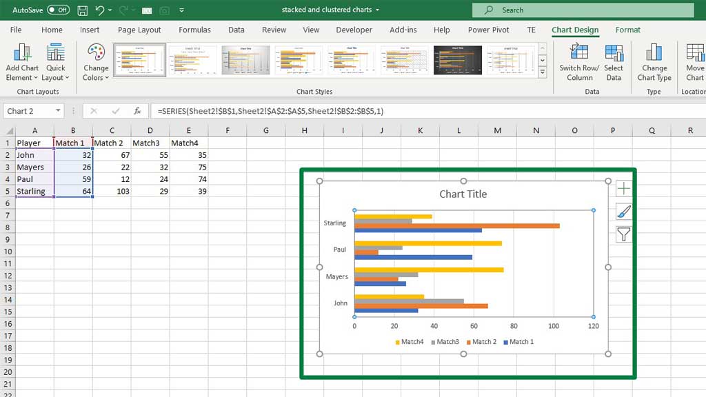
To fine tune the bar chart in excel, you can add a title to the graph.
You can also add data labels. To add data labels, go to the Chart Design ribbon, and from the Add Chart Element, options select Add Data Labels.
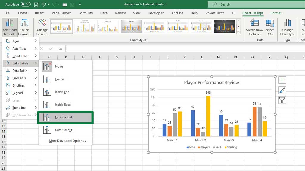
Adding data labels will add an extra flair to your graph. You can compare the score more easily and come to a conclusion faster.
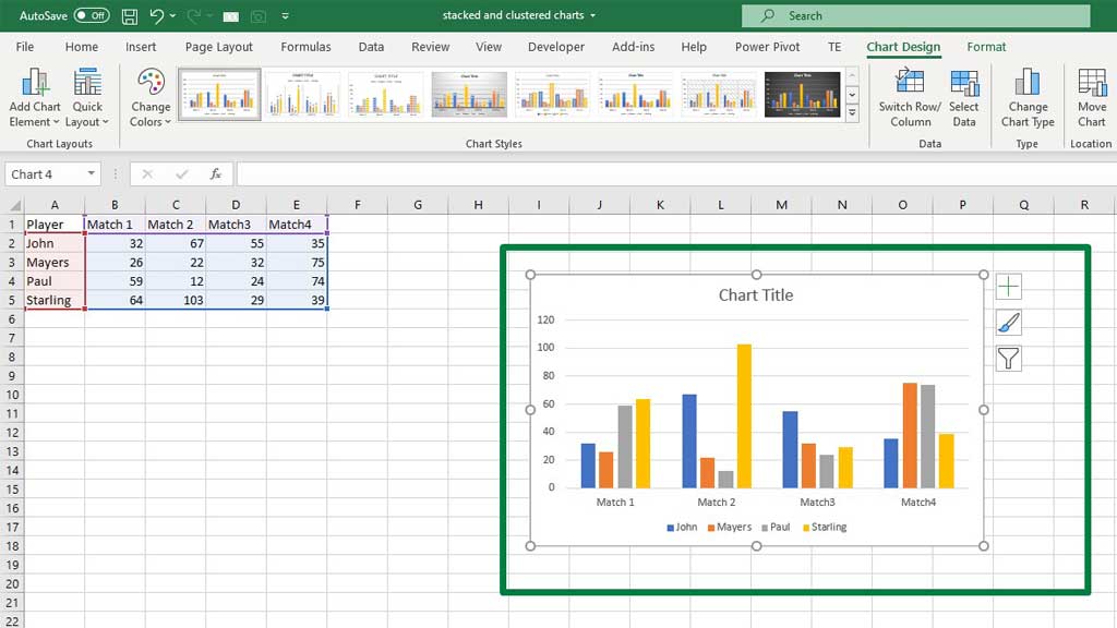
You can also choose a column chart that will give you a similar result.
So, there you go now you know how to create a bar chart in excel with multiple bars.
Conclusion
There are many occasions where we need to compare different categories of entities to review their growth and performance. For that, a bar chart is a great tool.
As now you know how to create a bar chart in excel with multiple bars, you can easily compare between groups of data and reach concrete conclusions.

Hi there, I am Naimuz Saadat. I am an undergrad studying finance and banking. My academic and professional aspects have led me to revere Microsoft Excel. So, I am here to create a community that respects and loves Microsoft Excel. The community will be fun, helpful, and respectful and will nurture individuals into great excel enthusiasts.