
The use of excel in statistical applications is variegated and huge. Excel has some built-in impressive graphing and charting options.
However, not all graphs and charts can be plotted simply in excel. You can tweak the data to make Excel think differently and that’s how complex graphs and charts like supply and demand, burndown charts, etc. can be created in excel.
Similarly, another tricky graph for excel is Dot Plot. Tricky in the sense that, Excel does not have a built-in feature for it (yet). But you can tweak the data and make a Dot Plot chart in excel.
So, let’s see how to create a Dot Plot in Excel.
What is a Dot Plot?
A dot plot is also called a dot chart and they are used for small data sets. The main key characteristic of this chart is that the identity of an individual observation is not lost.
As the name suggests, the chart uses dots or scores to identify each value and point or plots them in a scale or plain.
Duplicate values are stacked on top of each other. The dots are plotted against their actual data values that are on the horizontal scale.
So, if you have to draw a dot plot manually, you can just count the number of data points and stack them on top of each other for each point in the horizontal scale.
But in excel, if you follow the traditional graphing techniques, Excel will discard the duplicates.
So, you have to tweak your data.
So, let’s see how to create a Dot Plot in Excel by manipulating the data.
I will show you dot plots for both, single and multiple data sets.
How to Create a Dot Plot with a Single Data Set
Let’s start with a single data set.
Step#1 Create the Data Set
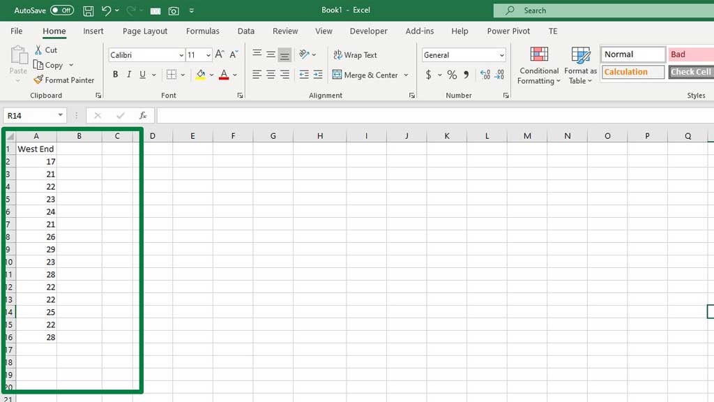
First, create a data set normally. For example, I have taken the time to reach West End by various drivers.
The data set tells the time to reach West End by 15 drivers.
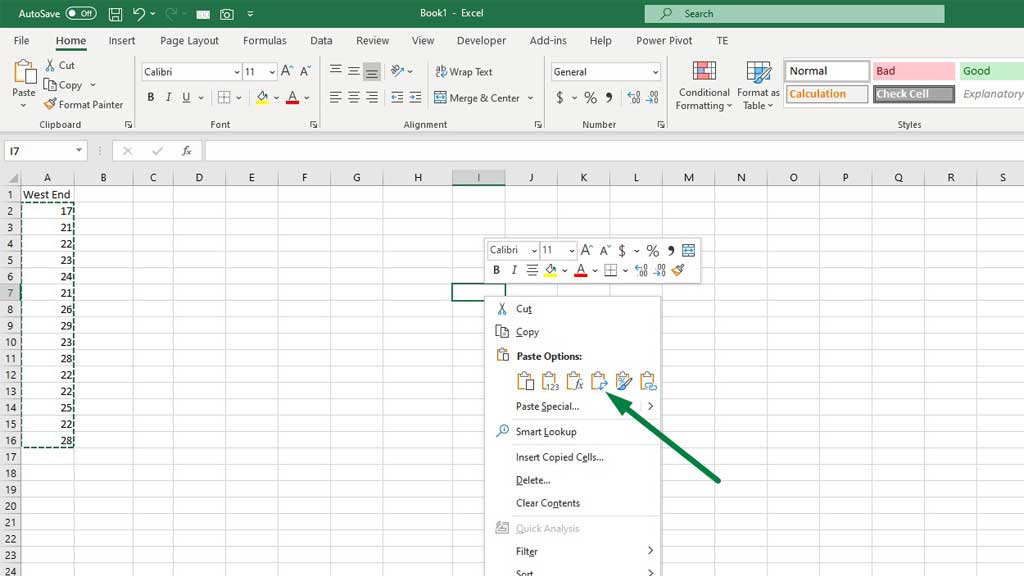
Step#2 Transpose the Data Set in a Different Range
To transpose the data set, first copy the data set. Then select any cell that is not part of the data set and press right-click. From the paste options, select transpose.
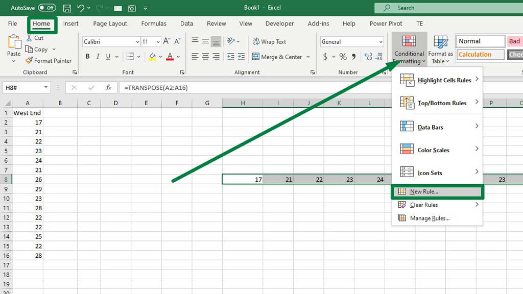
Step#3 Remove Duplicate Values
Select the transposed data set. Then from the Home ribbon, go to Conditional Formatting. Then select New Rule.
A dialogue box will pop up. From that box, select Format only unique or duplicate values.
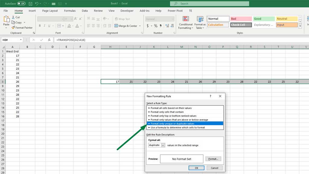
Select duplicate from the Format all: option.
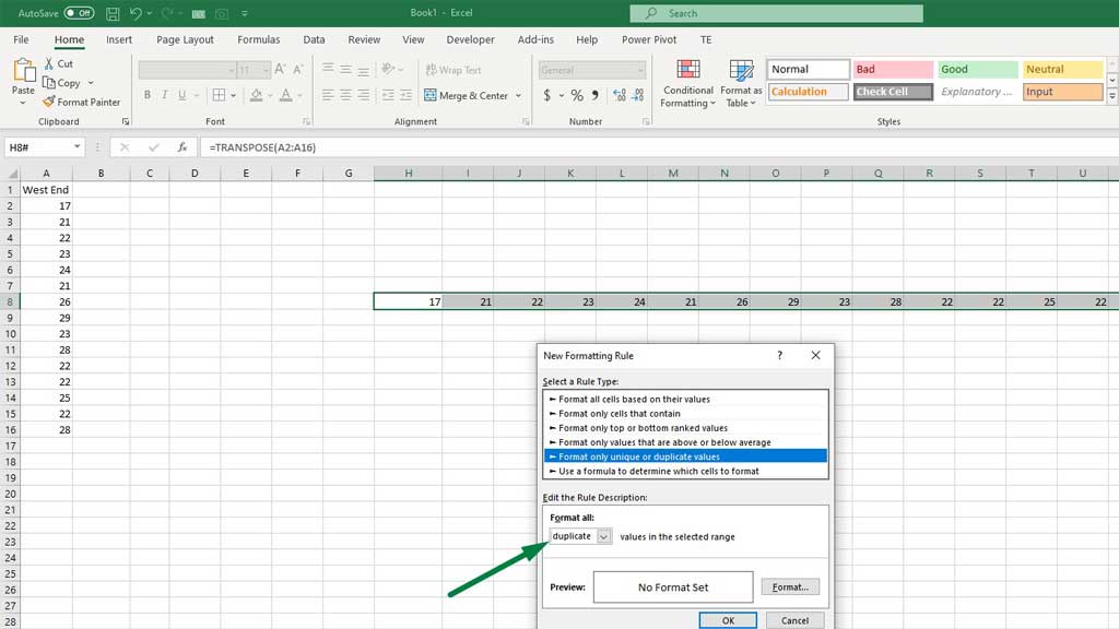
Then go to Format and select a color of your choice.
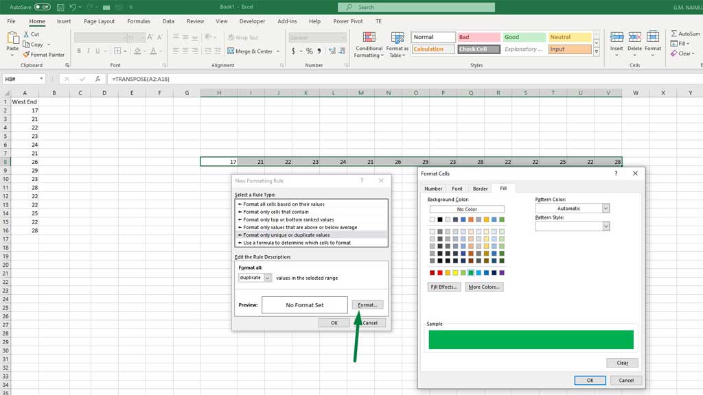
Now, press ok and you will see that Excel has highlighted all the duplicate values in your preferred color.
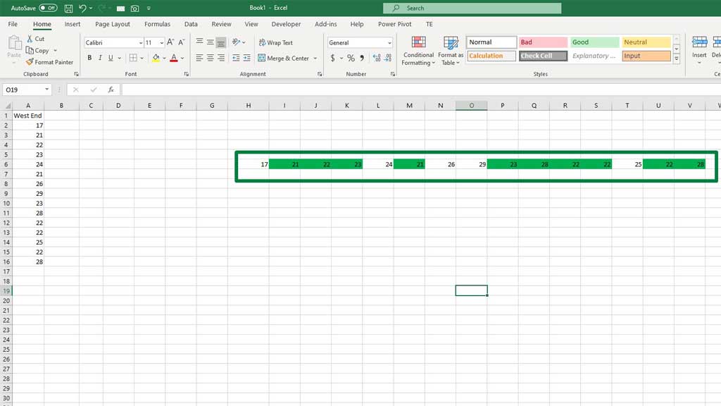
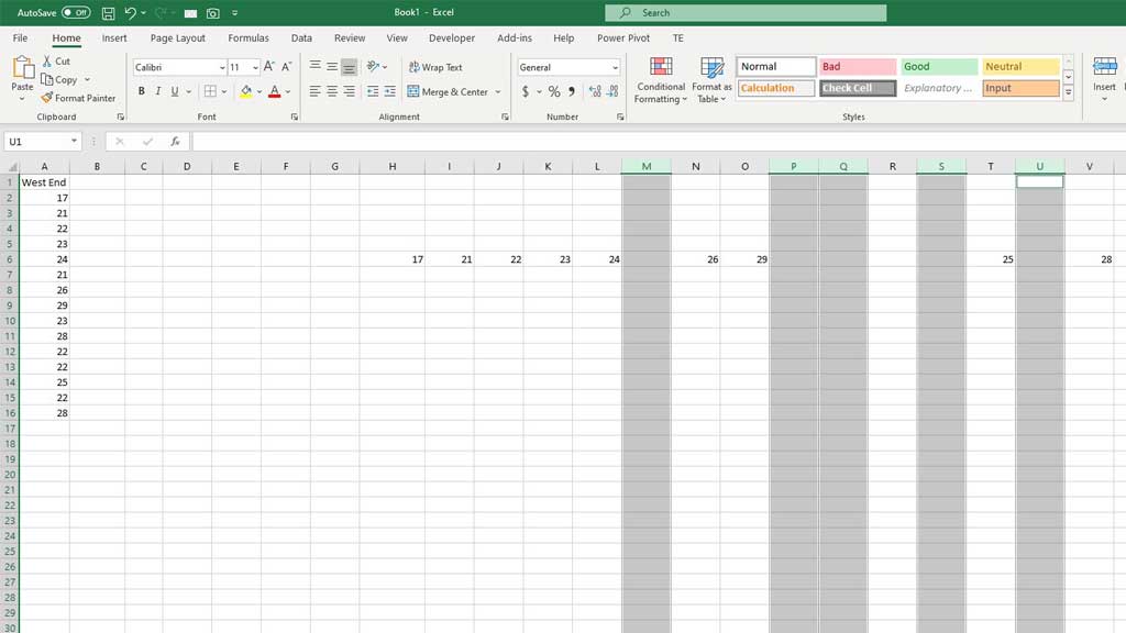
Now, carefully delete the duplicate values. For example, there are three 22s. Excel has marked all of them. So, you have to keep one and delete the rest. Be very careful about that, don’t delete all of them.
After deleting the duplicate values, delete the blank columns.
Step#4 Count the Data Points
Now, you have to count the values. Don’t worry, you don’t have to do it manually. Excel has a formula for that.
Type the following formula, in the upper row of the transposed data set:
=COUNTIF($A$2:$A$16,H6)
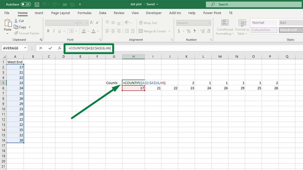
Drag the fill handle to the right to copy the formula for all the values.
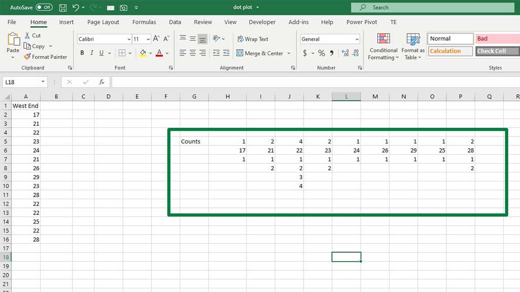
Step#5 Assign Incremental Data Points for Each Value
Now, look at the counts of each value. And assign individual data points incrementally. For example, 22 is counted 4 times. So, assign 1,2,3,4 to 22.
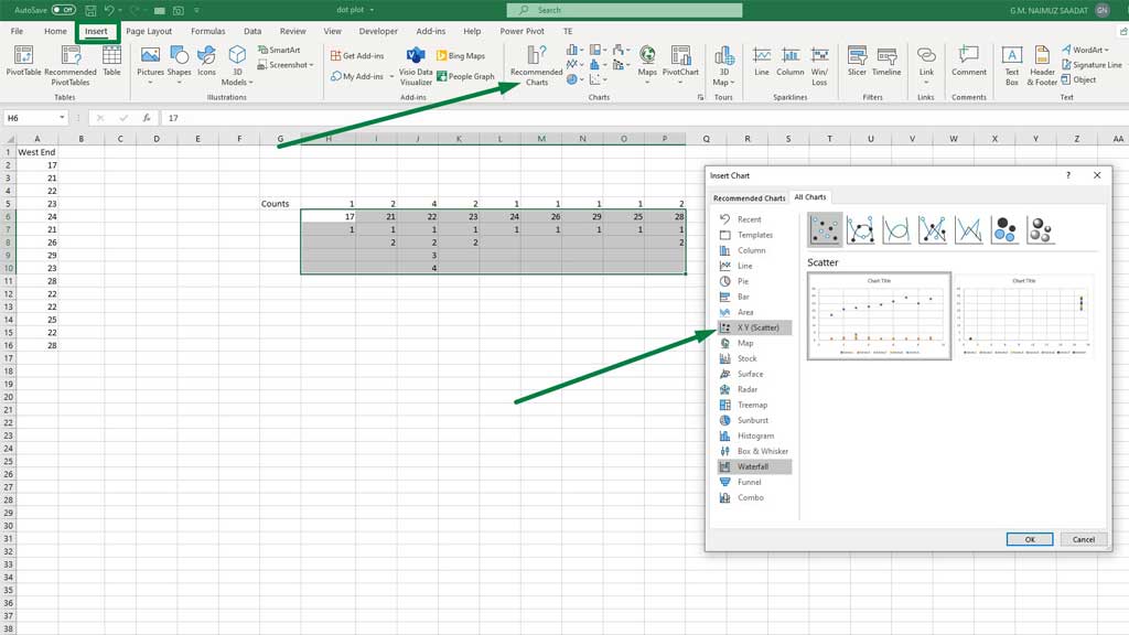
Step#6 Creating Dot Plot
Select the transposed column and their assigned incremental data points. Then from the Insert ribbon, go to Recommended Charts. From there, select X Y (Scatter).
There you have it, your dot plot in excel for a single data set is ready.
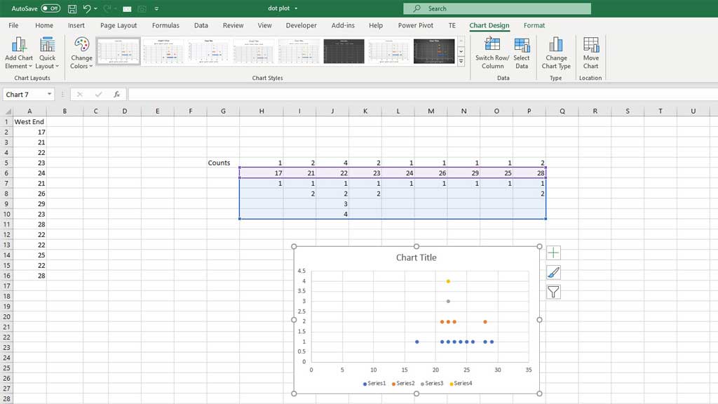
You can make it more understandable by editing the horizontal axis. Double click on the horizontal axis. Then set the bounds for minimum and maximum (17 and 28) and set the bounds for the units (Major 1 and minor in default) as well.
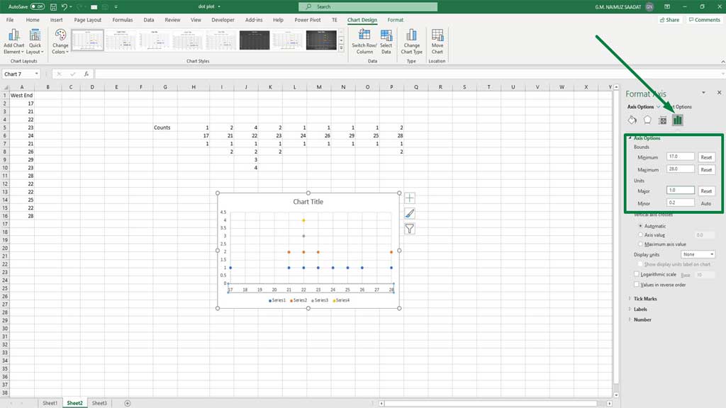
If you see, you can clearly see the duplicate values have been stacked on top of each other and you can tell how many data sets there are.
How to Create a Dot Plot With Multiple Data Sets
Now, let’s look at how to create a dot plot in excel for multiple data sets.
Step#1 Create the Data Set
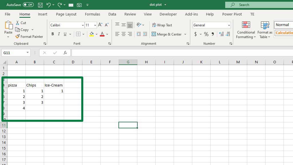
The data shows the number of people who have eaten a certain type of food. So, 4 people have eaten pizza. The data points have been shown incrementally because to avoid the duplicate data issue same as the dot plot for the single data set.
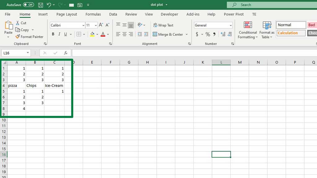
Step#2 Create the Data Set
Now, for each food type select a number and fill the rows with that number above the food type as shown in the figure below.
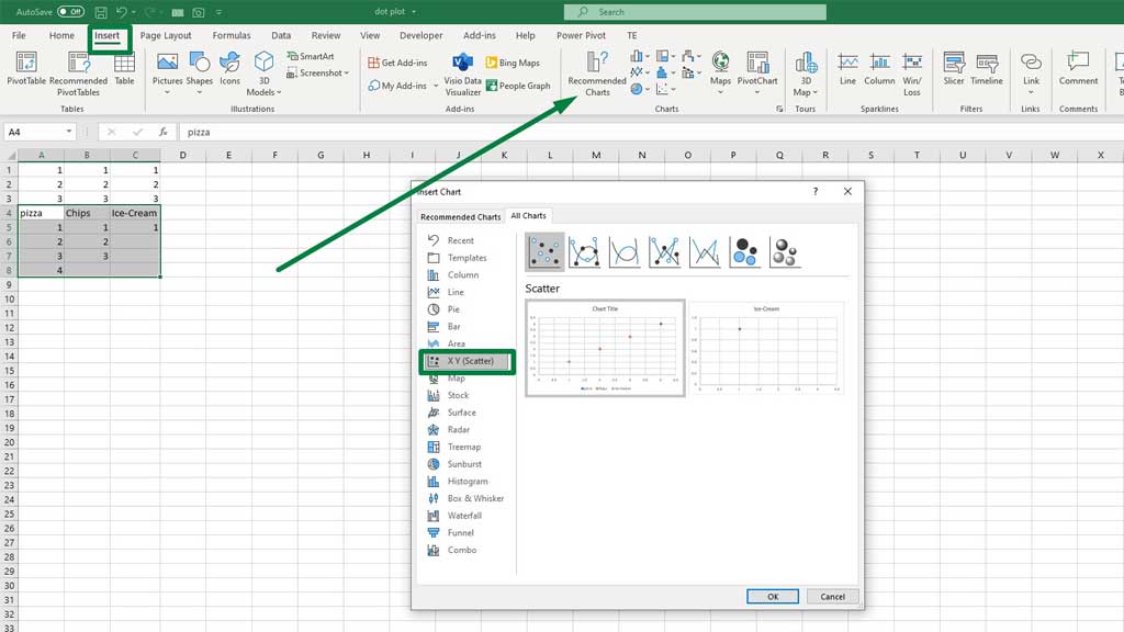
Step#3 Creating Dot Plot
Select the food types and their assigned incremental data points. Then from the Insert ribbon, go to Recommended Charts. From there, select X Y (Scatter).
Now, right-click on the chart and go to Select Data. You will see a dialogue box pop up.
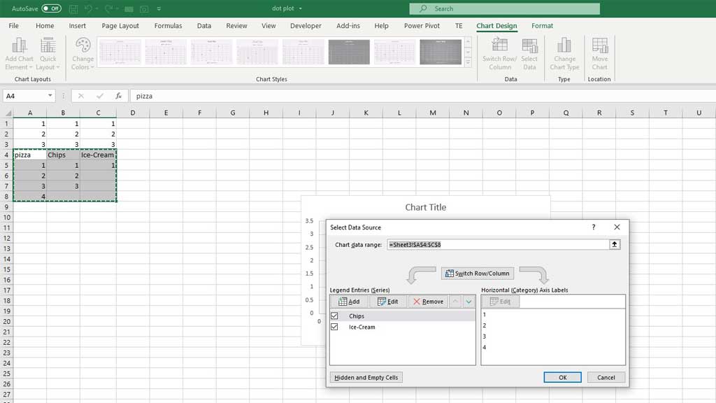
Now, go to Edit.
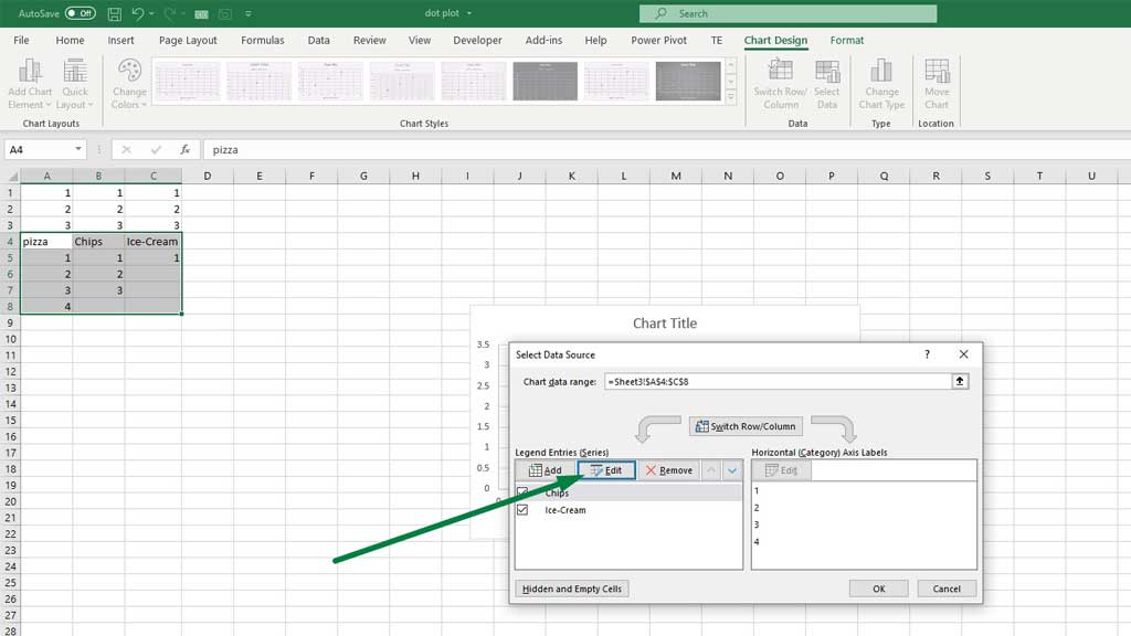
Now, select Pizza for series name, for series x values select the 1s and for series y values select the incremental values.
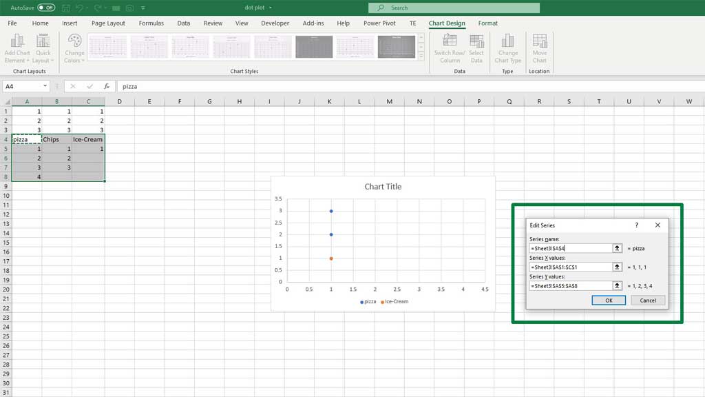
Similarly, do the same for the other food types as well.
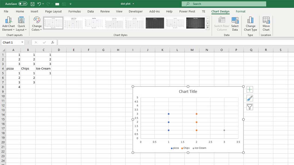
And voila you have created a dot plot in excel for multiple data sets.
Conclusion
There you go, though a bit complex and you have a bit of tweaking to do but it is possible to create a dot plot in excel. Now, statistics have become a bit easier for you.
So, now you know how to create a dot plot in excel.

Hi there, I am Naimuz Saadat. I am an undergrad studying finance and banking. My academic and professional aspects have led me to revere Microsoft Excel. So, I am here to create a community that respects and loves Microsoft Excel. The community will be fun, helpful, and respectful and will nurture individuals into great excel enthusiasts.